Showing posts with label iron/steel. Show all posts

Thursday, 2 January 2014

Dark mori


Mori kei and dark mori has found their way onto my clothes pinboard.


I'm not mad about clothes. To me they're not something to spend a lot of time and money on. While there are clothes I absolutely love and drool over, lamenting the fact I can't afford them, I'm not like many other girls/women who seems so very dedicated to clothes or at least to shopping for clothes. It's even worse with shoes, though that's partially because I can't find the type of shoes I really like and the one type of shoes I do love, the clogs, aren't suitable outside the farm. Of cause it's partially a money and body issue: if you don't bother to look at clothes because you can't afford them anyway or the designer clothes doesn't go up to your size, you don't develop an interest in them.

It doesn't however mean that I've got absolutely no interest in how I dress or in finding a good style. If I had the money, I would go hunting. Not for a lot of clothes, just enough to have a wardrobe for various occasions in a style I feel comfortable in. And that's the thing: without money to buy that style and relying mostly on a handful of plain, cheap clothes (some of which I've had since the 90's) for any occasion when I interact with other people and a bunch of boring mainly hand-me-downs of some sort or other for wearing around the farm. I have no clothes that really express, nothing that says something about who I really am. Well, of cause they do to some extent, especially my long skirts that family members and relatives "complain" about (I wear long skirts in winter if I want to, thank you very much!). But it's just skirts similar to what I like as I make due with the cheapest skirts, not the skirts that are the most my style. What I wear is plain and I don't really want to be seen as plain when that's not really who I am. Shy, yes, but not boringly plain as my clothes seem to signal to others.

Of cause, it would be easier to wear something my style if I could find my style and find the clothes that express something I want to express. With just a small interest in clothes, you don't always pinpoint a style as it's more about finding something simple and cheap that will do, something that can be used for a long time and is acceptable e.g. in school or at work. I have of cause found pieces of clothing I like and that's a start and I do drool over certain styles like goth and steampunk, but while I love the drama they haven't felt like an all around look for me. Those clothes are good for dressing out, but not dressing up so to speak. Love them, but couldn't see myself in them every day or even every weekend.

But recently something happened. Enlightenment.

Just before the new year, I happened to stumble over a new word, mori, and a search later, I found something that really struck a chord with me: dark mori. This japanese street fashion style is also called strega or black forest mori. It's a darker version of mori kei ("woodland style", often just called mori or, when referring to someone wearing the style, mori girl), which is a very romantic and rustic countryside look in white and light pastels, vintagesque and boho, layered and loose-fitting -- many times crinkled or slightly tattered -- clothes in natural fibres. Frills and laces can often be seen, though some seem more prone to love the sweet look with lace and subtle prints while others seem to prefer cleaner lines and solid coloured fabrics. Mori can be dreamy, victorian-inspired or modern minimalist with nature, countryside and green living as the common denominator. Some would probably see it, and especially dark mori, as a boho style and others would spot american hipster styles in the japanese street fashion style. It also share a characteristic with lagenlook what with the focus on loose, layered clothes. It's similar but not the same as the fashion style natural kei. The lifestyle associated with mori is one of closeness to nature, a love of reading and writing, bike rides, forest walks and tea drinking. Perfect for daydreamers and introverts with its focus on the little things in life and activities in solitude as well as meeting friends.

Cutesy mori kei and white-is-the-only-colour rural romanticism can be too sweet for me (and is far from the countryside as I, a farm girl, know it!) and that's where dark mori comes in. Sure, mori kei can include earthy purples, montana blues, burgundy, brown, deep green and other colours than white and beige but it's still a lot about those bleached neutrals. Dark mori adds a bit of darker colours (goth black as well as other colours, e.g. purple, brown and red), depth and a raw, worn look -- and it has an extra dimension that's really my style: it draws inspiration from the dark, shadowy forest rather than the light, sunny forest of the mori girl's daydreams. Fairytales, magic, mysticism  and european folklore/folktales are some of the sources the style finds inspiration in. All of mori is inspired by fairytales, but dark mori brings out the darker and more dramtic sides of them. If the ethereal mori girl is the sweet princess waiting in a sunny glade for her prince, the dark mori girl is the nyctophiliac or witch who doesn't shy away from the shadowy parts of the forest. It's more goth, to compare with another subculture.

But don't take my word for it, I'm a newbie in the mori world and hardly the one to describe or define it! You can read more about this relatively new style for example in this Goth (Stereo)type infographic, at Carnevale Salt and Strega's Forest. Notice that there is a certain width in the style and the three examples offer slightly varying definitions. The last one being more goth than the first two, for example, and focusing more on the dark or sometimes even grim strega, i.e. witch, while the other two focus more on romantic dark fairytales and nature.Of cause, you can see styles that would fit in the dark mori style, but which aren't called that and created by people that have never heard about mori or dark mori.There's also no definite line between mori and dark mori, it's more of a sliding scale where some are more drawn to lace and romance and others to the darker sides of things.

To some extent, I've always dressed a bit mori-esque at home with layered clothes and a love for long skirts, natural materials and at least a partial love of muted colours such as linen/sand and puce. (And an attitude against ironing as unnecessary, resulting in crinkled skirts.) And it's always been mixed with my love of nature, the countryside, poetry, fairytales and the calmer joys in life (reading, picnics, hot cocoa, sitting with a cat in the lap). Though my look has been rather plain with more jersey and other cotton knits that anything else at it's cheap and widely available in the mainstream mail-order catalogues and mall stores -- and that's all I can afford.

On the other hand, I've had the goth side of me since my teens, which has always loved the total opposite or the mori kei colours: black, dark purple, burgundy etc. And while I still drool over dramatic goth clothing, the dark mori style is so much more me. It even ties in with my penchant for (or rather, on-and-off relationship to) the steampunk style with it's more earthy layered and tattered victorian-inspired styles in shades of brown and brass. It might seem a bit boring to some, but I really love it.

For me, this was an epiphany of sorts. Not only did someone just put together so many of the things I love and find interesting into one concept for me to define with, but it also helped me find a focus on my style and a new keyword to explore. Not just my style of clothes, which was great, but my style of everything from interior design to jewellery. Not that all my jewellery is dark mori style -- far from it! -- but it's the kind of stuff many of my WIPs are about and defining a focus on a style has really been inspiring for me. It brought back some things I haven't thought about in a while such as runes, magic and the old witchcraft traditions which then mixed with the love of dark fairytales, which is always in the back of my head. And with a word or label to put on something, you can suddenly search for more things in the same vein and you can use it to find others who like the same things you do.

So really, I'm starting this year by taking up some of the thoughts, ideas and styles that have floated in and out of my life the last 15-20 years or so, tying them together and -- hopefully -- being able to more firmly express myself and shape my own style. Some start their year by finding a word to live by, I'm starting my year with a concept to explore!


Thursday, 5 July 2012

More buried patina


New blog post today again, but like yesterday's I don't really have much to say (other than I'm still here and haven't abandoned my blog?). Just showing a few pics.

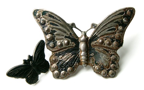
These are the rest of the pieces I patinated with the valkyrie stamping shown here. Together with that antiqued brass piece, I also added a few other things. Like the "antique gold" ring above. Not knowing what metal it really was (antique gold being used for brass ox as well as antiqued gold- or yellow-plate over various metals), I had no idea how it'd turn out. It ended up looking pretty rustic. Like it was excavated at some archeological site. Huge pic: IRL it's perhaps 20-25 mm wide. Can you see the faint striped patterns at the upper right and lower left parts? That's because those two sections were wrapped with craft wire -- made for this pic -- when buried and then removed afterwards. The wire acted almost like a resist (I'm planning on trying resist patinas too one of these days). An effect I want to explore more.


The second piece was a stamped silver-plated filigree drop. Here it was partially about testing the plating and partially about using what I could find. The patina is as uneven as it looks. I'm not sure if the rusty bits are patina developed on this piece (which might be a steel-cored brass stamping) or if it's stains from the third piece seen below. Anyway, I like the darken areas, but on the other hand you can get such an effect much easier with e.g. LOS or the egg oxidation method. I think this one will be subject to more patina or faux patina methods. Not sure exactly what -- heat patina? paint? rust paint? LOS? -- but something else will be done to it.


The third piece wasn't any kind of copper alloys, which is what I've used the most for buried patinas, but an iron alloy butterfly (more exactly a Vintaj Arte Metal decorivet). I'd painted it with acrylics and alcohol inks in several layers, but even after adding a protective, shiny lacquer it didn't look that good. So instead of trying to remove all the lacquer and paint, I chucked it in the sawdust, thinking vinegar, with time, effects everything. And it did. The piece didn't come out of the sawdust look like this, but some of the paint and original black patina (cf. small butterfly on the left in picture) had gone and the rest of the paintwork could easily be peeled off.

This too is a piece that will probably get another round of patina or paintwork. It does have an interesting aged or distressed look as is, but the steel colour is a tad boring. I want to keep the uneven surface with dark areas so perhaps a sheer wash of colour, heat patina or perhaps even a bit of rusting if I can make that happen in a controlled way (this might work, I've got some of that as well as the acrylic-based iron paint to go with it).

PS! If you want to see what rusted iron paint looks like I've shown an example here. Read about all the Magic Metallics products here.

Friday, 1 July 2011

Metallic butterfly wings


This little critter is an Arte Metal decorivet by Vintaj that I got as part of the delicious beady mail I got when winning the Rings & Things blog partner drawing this spring. If you want to see what it looked like before I altered it -- forgot to take a pic myself -- you can find a photo here.

Inspired by a keum-boo butterfly, I wanted to add a mottled effect to the wings using leaf metal flake. Leaf metal often comes in sheets, but flakes are -- as the name inplies -- a blend of different types/colours of leaf metal in small flakes. They are sold in different colour combination and here I choose to use one with purple and rose flakes on top of the gold, silver and copper ones. That is gold- and silver-coloured copper, not precious leaf metal.

Compared to working with sheets, it's very easy to "gild" a surface using flakes. For a mottled effect like this one you just simply dip the surface -- painted with size -- into the flakes, let it dry a little and brush of excess metal with a soft brush before letting it set completely. If you don't like the result, add size to points you like to cover with a different colour flakes and either dip again or apply single flakes to the spots using a soft, dampened brush.

The butterfly has tiny specks of leaf metal on the body. That's because I initially wanted to add foil to the bands across it, but didn't like the result so I scraped it off. You can't really see much of it IRL as the butterfly is smaller than in my photo, but I'll try and scrape some more off before sealing the gilding. Because it's copper-based, the leaf metal can easily tarnish unless coated.

Not my best work using leaf metal flakes, but a fun -- if slightly fiddly -- alternative to using paints, alcohol inks, gilder's paste and such.

Sunday, 29 May 2011

2x Artisan Clay: my may necklaces

So... I was supposed to blog about these a couple of days ago, but each day I've seemed to run into things that had to take priority over beading. Somewhat embarrassing forgetting deadlines. Putting it mildly. Well, better late than never I hope? Now at last you can see them, a couple of necklaces I made with the pretty crackled glass pendants from Artisan Clay. To see what Kristie and her design team made with these pendants and cabochon, check out this blog post.


These pendants feel like the perfect thing to frame and that's what I did, creating a RAW bezel using shiny petrol Gütermann seed beads. The bezel is embellished with amethyst charlottes and cinnamon luster hex cuts, which I stitched with an apricot red thread: the combination of the red thread and dark blueish beads underneath give the beads a special blended -- almost glowing -- tone that's hard to capture in a photo.

Normally you bezel cabochons, but it's almost just as easy to make a bezel on a pendant with loop. You just bead around and "through" the wire loop, which is a sturdy alternative to a beaded bail. Also, by attaching the middle row of beads to the loop it was easier to measure and fasten the bezel without having it sliding over the edge of the pendant.

The pendant is hanging from a doubled braided silk cord, which is space-dyed in dark green and blue. I choose the colour to balance the green and teal/petrol pendant with the purple frame.


For my second pendant, I choose a different approach. Here, I didn't want to obscure any part of the pretty pendant. Inspired by the black colour of the loop, I chose to work with blackened iron wire. I like to work with it, not least when doing designs inspired by nature. I think it has a certain dark romantic mood about it that I like.

This design is a variation of the links I made for this bracelet. I planned on doing double links then, but found it too time-consuming and dull. This time I didn't give up as easily. Still can decide whether I think it's too messy or just a pretty and natural tangle, though... I like the design, it's just that I wonder if I couldn't have executed the idea better. Hope you like it.

*

I really enjoyed working with these pendants. I've seen them many times and they've had a place on my ever-growing wishlist of beads and components I want to buy so I was really glad that Kristie gave me this opportunity. Thank you!

*

By the way, when I took these photos, I came up with yet another idea for the pendants. I'll show you what it was tomorrow.

Wednesday, 3 March 2010

Heat patina on stainless steel


Patinating metal using a torch is so much fun. I've tried both copper and stainless steel and really like the colours I can get on the latter. Here's just one example where I've used a dragon pendant I bought in a bead shop. Degreased it a bit and then I just heated it with my butane torch, making sure I kept moving the torch over the whole pendant.

I still can't control the outcome exactly, but it's a lot of fun so I don't mind if the result differs from want I wanted. For my first try, I used a thin steel sheet I picked up at the local craft shop. Very useful as there was room to experiment and test in what order the colours would appear. As you can see in my two photos, the back of the pendant also changed colour, but not as much as the front, where the heat was directed.


If you want instructions, you can find them e.g. at the M.A.I.L website. It not only covers "torching" but also how to heat metal in an oven or kiln etc. There's also an article on heat colouring jump rings using a skillet and stove top.

And one thing: if you try this, make sure you know what metal you're using. For example, never, ever heat galvy steel as you might release nasty zinc fumes. You really don't want to inhale those! Some stainless steel items in bead and jewellery shops are also chrome plated -- something that isn't always mentioned in the descriptions...

Tuesday, 12 January 2010

Flowers, berries and black iron

I like using blackened annealed iron wire fot its variegated, matte colour. Probably inspired by the fact that it is also a type of wire traditionally used in luffarslöjd/trådtjack, wirework made by bums in the early 20th century (they picked up surplus wire to work with, thus avoiding be arrested for vagrancy).

Above is an exemple of a creation I made after being given a bead challenge to make a picture frame. For it I used 0,7 mm iron wire and West-african flower beads made from recycled glass. The beads are very uneven, but very pretty. I had never done a frame using wire before so there are many things that could be done in a different way, but I still like it.


In the same challenge I also got to make a pen holder. Using the same 0,7 mm wire, I made this twined basket that remind me a bit of the baskets we used to pick potatoes in as kids working at our grandparents' farm. Not that it was decorated with flowers and leaves, but the sparse twisted wire is more or less the same. To make a dense bottom, stopping the pens and pencils from going through it, I used vaxed linen cord.

Then, in a word challenge, I got the word gooseberries. As soon as I got it I thought of my strangely coloured cat's eye beads -- and barbed wire. As gooseberry bushes only mean one thing to me: thorns!

Growing up in the countryside on a small farm, we still used the old-fashioned ways sometimes. This included using barbed wire instead of electric fences every summer when a couple of grandpa's heifers were grazing on our lands. We now have tonnes of that springy, errant wire in storage. It is difficult to work with, especially seeing I couldn't anneal it, but having held and pulled barbed wire since I was a toddler I was experienced enough to wrap it without being scratched more than once.

I only had a few cat's eye beads so I decided to make it autumnal, the last gooseberries for the season left on a near defoliated bush. I attached the berries and leaves using handmade iron wire headpins, stringed onto more wire, which I twisted together making a short vine. As you can see, the vine is separate from the thorny barbed-wire wreath.


Of cause I also make jewellery using this wire. More about that some other time.
Related Posts Plugin for WordPress, Blogger...