Showing posts with label brass. Show all posts

Tuesday, 3 September 2013

Pébéo Fantasy test pieces


I thought I'd better blog about this before forgetting about it. As you can see, there's two more pieces than in the sneak peek posted here. As mentioned in that post, the paint comes with instructions just must follow to the letter in order to get the effects you want so therefore I thought this post would start with my first pieces, which all failed, and tell you what I did wrong.


The first fault I did was not paying attention to the instructions saying mix well. I just shook the bottle and stirred the knitting stick (for applying the paint) around the bottle once. That's usually enough with ordinary paint, but this isn't ordinary paint and you really, really need to stir well as the effects won't appear if the paint isn't mixed properly.

The second fault was taking the next set of instructions lightly. Flat, horizontal surface means that and not just something sort of horizontal and flat-ish. I wanted to paint the bottom of a cab. To keep it horizontal I fixed it onto the table using Tack-It (häftmassa) and moved the cab until it seemed to be horizontal. It wasn't 100 % so and therefore the paint slowly, slowly moved to one side, which ruined the possibility for the patterns to emerge.

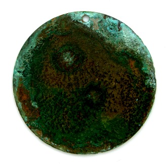
The third fault I made was forgetting how slowly the paint dries and thus making the very first piece, the round bronze tag, on an impromptu worktable. When moving it, the charm got rolled over by a paint syringe, got knocked into the wall of the cardboard box and then, finally, was dropped on the floor. You need to work on a table or other space where you can leave the pieces untouched until they harden. And don't pick them up just because you want to look at them more closely, even if they've been drying for two hours. I did that with the piece below and accidentally put my thumb in the bezel, ruining the paint (which was one of my first successful pieces) and having to redo it....


same bezel with glass cab


So far you can see that I've tried adding paint both directly to a cab and to a bezel covered by a cab. You really should do the latter and I'll explain why. First look what happens when I flip the big glass cab from the photo at the beginning of this post:


Whatever pattern there is on the surface won't be on the bottom. When painting the back of transparent glass cabs, it's the bottom of the paint you will see once the cab is being used. It's at least a small comfort that the Fantasy paints have a mica shimmer that makes them nice to look at even when you fail to get the effects desired. These two cabs are still useful even if they're so far from what I wanted to make.


One last fail, which I don't really see as a fail is what Cookson Gold in their tutorial call an amalgamated effect: if you wait too long (like, a minute or two) to add a second or third colour, the new colour will be engulfed by the first one and the result will either be a marbled look (bracelet) or just one colour on top of the other (copper connector). If filling multiple bezels it's better to add all colours to one bezel before moving over to the next. Pébéo doesn't tell you that on the package so be sure to remember this!


But enough with failures -- I've had some very successful results too! And for every failed piece (almost) I've learned something.


These two glass pebbles -- that I made before realising cab painting was a dead end -- might not look very special, but I'm including them as they were my first two successful attempts at using Prisme. You can see the front of the eggshell white and purple cab above.


For most of my tests I've been using 2x2 cm glass mosaic. They're a good, handy size and will hopefully be very useful and versatile when it comes to actually doing something with them. In the samples above I've used two colours in each (except in the apricot tile in the middle of the top row), mixing Prisme with Prisme, Prisme with Moon or Moon with Moon. The only real flop was the red one in the upper right corner: the lighter red in the centre is Prisme, which should've turned bubbly as in the rest of the samples.


I've also filled both tags (need to be careful moving those) and bezels. Here are two examples of that, both using two colours of Prisme and as you can see they've fused together on the brass round in a way they didn't do in the bezel (part of a bangle).


My final samples are both made using Vintaj brass tags. In the first one I mixed three colours of Prisme. Nothing fancy, really. In the second piece I wanted to see what happened when you have a relief. As you need a horizontal, flat surface would the paint migrate from the relief (in this case decoupaged thin cardboard leaves)? Except for the edges, the paint did cover the embellishment well, though I'm not sure it was a good idea to paint on a sealed pendant considering the Fantasy paints are solvent based. Not sure if that explains the lack of pattern in the Moon paint or not.

Now, when I say that the paint is dynamic and moves, it doesn't just mean that it'll flow on a surface that isn't horizontal. It means that the paint changes, morphs during the time it takes for it to harden. The patterns develop up until the paint is dry, meaning the results are unpredicatable. A fun surprise. Below is a photo I took of the pendant above just two hours or so after applying the paint (never occurred to me to snap one right after dripping the paints on the charm). Notice the differences, both in pattern and the proportion between the colours. (The harsh shimmer, however, is due to the artificial light and camera flash as this photo is taken indoors at night.)


It's not a paint for control freaks -- but for everyone who loves unpredictable results and find morphing paints exciting, it's heaven!

Sunday, 23 September 2012

Gesso and chalk


When I bought a jar of gesso for a project, it was only sold in big jars (with a price to match). Great for painters, but when making jewellery you don't use very much at the time. So there's a lot of it left. Now, gesso is great and has many uses so I'm sure it'll come in handy some day. And I want to buy black gesso too to complement the white.

The other day I got the idea to just play around and smear some of it on two small Vintaj brass blanks. On the left tag, I used a smooth brush stroke motion (didn't actually use a brush but a piece of paper towel) and on the right tag, I dabbed the gesso with the paper.

Then -- just for the fun of it and because I hadn't used it yet -- I brushed coloured chalk on the not fully dried gesso. Not sure it's something that's going to lead anywhere. It was just for fun and because I had nothing else to do. It's two little doodles made without a plan or idea, almost stuck after having that inital thought of "what if I gesso some metal and brush on chalk to tint it". Nothing special to look at, but I'm hoping to see some sort of potential in them nonetheless.

To conclude, the blanks had me thinking of more ways to use gesso on metal -- you've seen me use gesso on metal before here -- and what to do with my chalks. (And what kind of fixative or varnish to use on chalk and gesso; these pieces aren't sealed.) Both gesso and chalk are fun to play with. I bought gesso inspired by designs and techniques I'd seen in paper crafts and mixed media while I got the chalk with the intention to use it on polymer clay. Then I realised I'm rubbish at working with clay and the chalk was never used. Perhaps it can be used on the epoxy clay I have lying around? I do believe it can also be used on paper so maybe it'd be a good thing to think of some sort of paper-based project for these materials.

But I do think I want to develop this idea of gesso and chalk on metal a bit more too. What do you think? Do you perhaps even have some tips or ideas to share or links to others who do great things with gesso and chalk?

Wednesday, 5 September 2012

Tinted patina


Double post today. Just a quick snapshot of a couple of ammonia patina'd bronze tags. Like most of my tags, the most intense blues faded from the crusty patina surface. Having seen metal colouring techniques and patinas that were made on a base of a "primer" patina, I thought why not dye the verdigris crust with some alcohol ink. To boost the colour in the first case (left) and add another colour in the second (right).

You could probably do something more interesting with this that just add a few drops in the middle of the tag like here. This was just a first try to see how the ink reacted with the patina, how it'd spread and how well it'd stick.

Adding the pic, I was reminded of an old photo of a rose I made using layers of alcohol inks in a two or three different shades on a brass ox flower. Add a really matte spray lacquer and you get a nice velvet-like feel. (That white smudge is made by the nick in the lens on my old camera -- will not be missing that about it!)


Saturday, 28 July 2012

So-so patina results


Not all patinas turn out the way you like it. Some will turn out different, but good, or perhaps even different and great. Others will turn out different and disappointing.

The heart above is a plated stamping, silver ox or something like that. Those stampings are usually lacquered to protect the antiquing and keep the plating from tarnishing. I don't always bother with such details as seeing if there is lacquer and if so remove it before trying to patinate a piece. That was the case with this iris heart. I just chucked it into the baker's ammonia and spirit vinegar (ättika 24 %) sawdust and checked in on the progress from day to day.

This piece have been removed from the sawdust and rinsed in water several times, which is one of the reasons it doesn't have a crusty or cobalt patina. Today when I took it out and let it dry, I also brushed it vigourously with an old tooth brush, removing some of the blue dust of the patina. The result almost looks like an old/antique, not very wellmade, paintjob.

Not sure what I'll do with it. Keep it like this or try to enhance the motif a bit in one way or another (adding LOS? polish the relief? gesso in recesses?). I'll have to think about it for a while longer.


This is a Vintaj brass tag I put in the vinegar-and-tea leaves jar. Originally I had attached an image transfer to the surface (Nunn Design image transfer sheets), but forgot to check that the lacquer was compatible with the plastic film. It wasn't -- I watched in horror as the beautiful butterfly image dissolved in front of me! So it's just been laying around, looking like a ruined mess. Adding some verdigris couldn't make it worse so that's what I did.

Above is a pic of the back (also lacquered) and below is the front with the ruined image transfer.


Finally, another piece I put in the ammonia jar:


Not exactly sure what the material is. It looks very much like pewter, probably lacquered but it doesn't really look plated as it was darker than most silver and white plates. At first it looked like the patina hadn't had the slightest effect on the charm, but once I took it out, I saw that the patina solution had darkened the metal significantly. (The reason one edge is lighter is that it protuded out of the sawdust so it wasn't fully buried as the rest of it.)

This is the back of the charm. The front is so fugly it doesn't feel work showing. In fact it was the "fugliness" of it that made me sacrifice it for the patina experiment in the first place.


~*~

Do all these patinas last? No, unfortunately not. Even if lacquered, some of my samples in this blog have altered in appearance already after a few weeks. Maybe they needed heavier layers of the sealant, maybe I needed a better sealant, maybe the pieces should've been rinsed and/or neutralised better before sealing. The patina tutorials and recipes don't always discuss such details.

You need to make sure you stop the process you started as best you can or at least slow it down as much as possible. But it just isn't always enough to completely stop it -- and sealants often alter the patinas one way or another (a common problem is that matte sealants dull heat patina colours or alter the hue). I've also had problems with some lacquers that have seemed to "boost" the patinas before drying. It's all about experimentation at this stage.

Thursday, 12 July 2012

More patina: the back


I took these pics thinking they'd end up in one of the previous patina posts. Just a "by the way, check out the back of that stamping" I just sealed, but it didn't happen so why not show it here?

On the left is the back of the brass stamping I first buried in vinegar-soaked sawdust and then torched (see this post). Classic red heat patina. As you can see, the patina looks very different on the side you torch compared to the back, which is turned away from the heat source. To get a similar patina on both sides, you need to apply the heat on both sides. I prefer the colours/patterns being different so I almost always only apply heat on one side (usually the front).


On the right (in the first pic) is the burnt back of the heat patina and gesso stamping featured here. It's burnt because I originally wanted to use it as a cabochon glued to a bead embroidery foundation and therefore filled it with white/hobby glue. I didn't use it and so when I wanted to play around with patinas I had to get the glue out and the easiest way -- after having tried to pry it out -- was to heat it enough to melt it. Probably not the most healthy way to do it, but I was careful (not recommending this method to others!). The burning happened later when applying the heat patina.


PS! Don't forget to help choose a twin bead design to write a free tute on -- check out this post!

Sunday, 8 July 2012

Patina mishap


You remember my valkyrie from this post? The one that I didn't know if I wanted to do something more to or keep as it was as the patina was rather nice. Well, as mentioned in the comments I decided to keep it as it was. All I had to do was seal it. It took a few days to decide so in the meantime the stamping sat on the worktable. When a few new spots of verdigris appeared I decided it was time to brush it off and seal the stamping before it got another, less wanted patina.

So I did it. Using a sealer for patinas. But...


This is what I found when the sealer had dried. It looks like bark covered in bright lichen. Or a loaf of bread suddenly "attacked" by mold... A nice effect in a way, but I didn't want it on this piece! On a piece with an abstract pattern it might look great, but here I feel it obscures the motif too much -- and it doesn't look like an old artifact either so I can't go for the "just excavated and ancient" style either.

I don't know why it happened. Maybe I'd not rinse off the vinegar enough or neutralised it. Maybe there where spots of verdigris that accelerated when mixed with the wet waterbased sealant (one that you brush on, not spray sealer/lacquer). Either way I ruined my patina.

What remains to do now is to choose whether to keep the piece like this or do something about it. It's not like it can get more ruined... (I've thought about adding crackle glaze on patinas, something along the lines of Tammy Tutterows alcohol ink crackled metal pendants pehaps, so maybe I'll do that on this one, but I'm not sure. 

In the meantime I guess I'll have to just enjoy the colours. There's a nice mix of green and turquoise in places and patina at the bottom is pretty too.


Thursday, 5 July 2012

More buried patina


New blog post today again, but like yesterday's I don't really have much to say (other than I'm still here and haven't abandoned my blog?). Just showing a few pics.

These are the rest of the pieces I patinated with the valkyrie stamping shown here. Together with that antiqued brass piece, I also added a few other things. Like the "antique gold" ring above. Not knowing what metal it really was (antique gold being used for brass ox as well as antiqued gold- or yellow-plate over various metals), I had no idea how it'd turn out. It ended up looking pretty rustic. Like it was excavated at some archeological site. Huge pic: IRL it's perhaps 20-25 mm wide. Can you see the faint striped patterns at the upper right and lower left parts? That's because those two sections were wrapped with craft wire -- made for this pic -- when buried and then removed afterwards. The wire acted almost like a resist (I'm planning on trying resist patinas too one of these days). An effect I want to explore more.


The second piece was a stamped silver-plated filigree drop. Here it was partially about testing the plating and partially about using what I could find. The patina is as uneven as it looks. I'm not sure if the rusty bits are patina developed on this piece (which might be a steel-cored brass stamping) or if it's stains from the third piece seen below. Anyway, I like the darken areas, but on the other hand you can get such an effect much easier with e.g. LOS or the egg oxidation method. I think this one will be subject to more patina or faux patina methods. Not sure exactly what -- heat patina? paint? rust paint? LOS? -- but something else will be done to it.


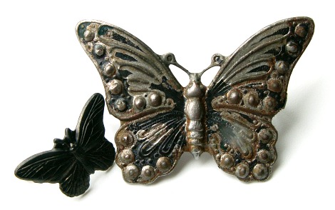
The third piece wasn't any kind of copper alloys, which is what I've used the most for buried patinas, but an iron alloy butterfly (more exactly a Vintaj Arte Metal decorivet). I'd painted it with acrylics and alcohol inks in several layers, but even after adding a protective, shiny lacquer it didn't look that good. So instead of trying to remove all the lacquer and paint, I chucked it in the sawdust, thinking vinegar, with time, effects everything. And it did. The piece didn't come out of the sawdust look like this, but some of the paint and original black patina (cf. small butterfly on the left in picture) had gone and the rest of the paintwork could easily be peeled off.

This too is a piece that will probably get another round of patina or paintwork. It does have an interesting aged or distressed look as is, but the steel colour is a tad boring. I want to keep the uneven surface with dark areas so perhaps a sheer wash of colour, heat patina or perhaps even a bit of rusting if I can make that happen in a controlled way (this might work, I've got some of that as well as the acrylic-based iron paint to go with it).

PS! If you want to see what rusted iron paint looks like I've shown an example here. Read about all the Magic Metallics products here.

Saturday, 30 June 2012

Instant satisfaction and slow patinas


Being a seasonal worker and hourly means I don't really know when or how long I will work until the day before the work is needed. Good thing about the job in the potato fields is that it's just a limited time -- and I desperately need the money. Bad thing is it's hard to really plan things in advance. Things like starting a new, big jewellery project (especially things where you want to be able to work without interruptions). But one thing you can do, though, is to prepare those things that take time but little work. In other words: buried and fumed patinas.

I tend to forget, but last weekend I actually chucked some components in my sawdust-and-vinegar jar. While I do enjoy such slow media as embroidery and prefer hand tools to fast and effective power tools, I -- like most people -- want instant satisfaction. So patinas that takes days to develop and boringly slow processes like stone tumbling sometimes feels too slow, too time-consuming to bother starting up. But not having as much time to work as usual, but lots of time between jewellery-making sessions, throwing some brass and bronze in the jar seemed like a good idea: the vinegar and brass would do all the work while I was away. No waiting arond impatiently, seeing the jar before you all the time but knowing it wouldn't be ready in ages yet. Just getting home from work one day and it'd be finished. Perfect. Sort of (it's easy to forget that you put something in that jar or that container when you don't see it all day long).

This is one of my latest examples. The idea was to let the vinegar eat away the lacquer and antiquing (paint) on this brass ox stamping, etching the metal which I'd then scrub to get a shiny, textured surface like in this example. But after washing of the verdigris, I kind of liked the colours. Uneven and your can still se the paint used for the original antiquing, but there was still something I liked about the matte, mottled surface. Something that was hard to capture with the camera, but hopefully some of it shines through the lens.

Now I'm not sure what to do. Stick to the original plan or keep it like this. Or perhaps even add some heat patina like in this one. Or add some colour using e.g. paints or inks? I'm running out of stampings or I'd try something more structured and do several pieces at the time (to get the same texture/patina to work from) and try the different ideas, one on each piece. With one piece you just can't always go back if you regret the decision to add another patina, colour or finish (polish, sanded matte, hammering etc). There's no ctrl+Z in real life. At least not always -- some things can be remedied, but other simply can't and it's exactly those things that can't be undone that I'm wondering whether to do or not in this case.

Decisions, decisions...

Wednesday, 13 June 2012

Patina and decoupage


Because of work, I haven't felt like starting a new project. Instead, when time has permitted, I've just experimented with bead-weaving ideas, played with patinas and colouring etc. Here are a few things I did today. The round tags are bronze and the flower vines are brass.

I've been thinking about combined patinas lately, what with the gesso and heat patina stamping here and the heat patina'd vinegar etched/buried patina stamping here. Therefore I picked out two of the tags from this experiment and added a peanut oil heat patina. (As a comparison, see these tags, which are just peanut oil with no prior patination.)

The dark tag above is almost burnt peanut oil on a "buried patina" (= leave metal in vinegar soaked sawdust).  [UPDATE: mixed up the info so here's the correct description of the tags.]  I'd polished the patina off with fine steel wool to get a shiny, textured surface so it was textured but not patinated when oiled. I also dabble with a second tag where the etched and slightly verdigris surface wasn't treated in any way before brushing on the oil. No pics of the front that one (i.e. the side the heat was applied on) -- but below you can see the back of it. I liked the softed colours it got.


These pics are macro shots: the actual size of the bronze tags is 17,5 mm in diametre.

If you've read this Manekis Pärlblogg post, you might've seen the branches below. I wasn't satisfied with the gesso finish so I dipped the whole thing in oil (rapeseed, not peanut this time) and heated it. Carefully as I'm not sure it's a good idea to torch acrylic-based gesso.


Nothing special, but I think it's an improvement. It's much darker, but you can still see some of the gesso, especially on the flowers.

And then, finally, a WIP photo.


One day I said to myself: "well, I've had this decoupage glue for textiles forever, when will I actually use it? Napkin decouapage on a piece of fabric could be a good foundation of embroidery or bead embroidery and I am looking for some fun, exciting and unusual surfaces to stitch on. If I don't do it today I'll probably never get around to it." So I found a cotton fabric scrap and a rose patterned tissue and begun work. It's one of those boring techniques were you have to wait for the glue to dry for 24 hours before heat setting it and being able to use it.

Now it is heat set and dried, but it's still laying around as I'm not sure what to do with it. Thinking jewellery (bracelet), but how do I want to embellish it? Could leave it as is, but using the decoupage as a surface was the original idea and I want something fun to stitch on... This is one of the bits and bobs laying around that I hope to be able to devote some time to after midsummer.

Apart from embroidery of various kinds, I'm really, really looking forward to some patina and colourisation sessions this summer. I'm obsessed with those two things, embroidery with or without beads and colour on metal, right now. (One patina I want to try soon, after seeing this, is heat patina on rusted steel and then of cause I'm dying to try coloured pencils and perhaps add some distress embossing.)

To end this post, another pic that'll appear on my other blog later this week: gold wax on black brass stamping (no, it's not Gilder's Paste). The wax really brings out the details, which the original shiny black finish didn't.


Sunday, 3 June 2012

Gesso patina


Still busy with the harvest, but don't want to abandon the blog totally. So here's a pic of a brass stamping I was playing around with recently.

Originally, I just wanted to give it a white wash using gesso. Gesso is a product I just recently discovered. I'd heard about it before, but just seen it as something for painters, not for me. But then I began to see it in mixed media works and on metals coloured using coloured pencils. So I got a jar -- and I love it: the versatility, the creamy white colour, the matte finish, the toughness, everything.

The stamping with its clumsy gesso patina had been laying on my worktable for months as I wasn't pleased with the result. So the other day, when I felt like torching something, I gave it a bit of a heat patina on top of the gesso, perhaps inspired by Victoria Altepeter's patina examples.

Not sure if it's a good idea to torch acrylic-based gesso... Don't encourage others to apply an open flame on anything plasic based, but that's what I did. Carefully and with (sort of) good ventilation, but still nothing to encourage. Probably better to get the heat patina first or go for a fumed/buried/immersed patina on top of the gesso instead.

Next time I might dilute the gesso -- as mentioned here -- to make it easier to apply and, most importantly, to wipe off.


PS! If you want some gesso inspiration, check out my pinboard Crackle and patina finishes on Pinterest.

Wednesday, 4 April 2012

Patina on patina


Do you remember this brass stamping that I showed back in August when experimenting with patinating and vinegar etching some brass? I wasn't that fond of it, even after having polished it a bit and added some colour (mostly alcohol inks and then a few dabs of acrylic paint on that).

Well, at the end of February -- as you can read here -- I finally got around to trying out that peanut oil patina I'd wanted to test for ages. Already then I thought about adding some torched oil patina to the stamping as it was in my mind already ruined so what not just keep playing around with it. For a couple of different reasons it didn't happen. I had brushed on some oil (rapeseed, not peanut), but then had to let it just sit there.

Today, I picked up the stamping on the cluttered worktable and torched it. It was like being back in chemistry class as the copper salts from what remained of the original verdigris patina coloured the flame green (it's the only laboration I remember from chemistry, burning various metal salts, which made the flames turn a rainbow of colours).

The result was a colourful heat patina on a very tortured piece of brass. You can have a lot of fun with a simple little butane torch (or in my case a Dremel Versatip, a kind of "multi heat tool").


If you wonder about the background on which the lady stamping is sitting, it's a rusty old steel garbage can belonging to my dad, who use it to burn rubbish. The white is actually a slab of paint from when it was used as table leg when he painted whatever it was he had made then (probably the revamped hammock swing). It has endured heat as well as some really tough weather as it sits outdoors around the year. Which means that the lid has a lovely rusty patina nowadays.


PS! I'm not a very active blogger at the moment. Nor an active anything else (still haven't gotten through the suddenly spring blog hop and don't respond much on blog comments, I fear). I hope to catch up a bit more this week -- after having done my work as a jewellery design contest judge, which is what I'm focusing on right now -- but I better not promise anything or I'll just feel stressed about not finishing what ever I promise in time. Just wanted to say I haven't forgotten anyone or anything like that. And I always read and appreciate blog comments even when it doesn't look like Ido.

Wednesday, 4 January 2012

Embroidery on filigree -- an update


I wrote about embroidering on filigree a few days ago and promised to show some more of it when it was finished. And here it is, my embroidered gunmetal filigree.

I'm thinking of adding a backing of leather, faux skin or somesuch to protect the threads on the back and add findings. Because of that I haven't fastened the floss used to whip the edges as I'll have to redo it, whipping the backing to the filigree. It'll either be a pendant or a brooch. Brooch was my first thought, but I fear the cast filigree might be a bit too heavy for that so a pendant is more likely now.

I also made a second pendant, stitching on a thin stamped brass filigree. It's a very simple "design" that I made while pondering what to stitch on the gunmetal filigree.

The brass filigree had larger open spaces which made it harder to stitch on, both in terms of creating designs and stitches and in terms of hiding the threads on the back (e.i. you can't travel with the thread as much as in the gunmetal filigree).

Tuesday, 4 October 2011

Very Vintage Challenge


Today is the day. Time to reveal what we've made for the Very Vintage Challenge, hosted by Michelle Mach. This is a kit challenge where each participant has bought an autumn-themed kit to create with. What makes this kit challenge a bit special was the fact that Michelle not only sold full kits, but also a few "mini kits" with fewer items, but in the same style and on the same theme as the big kits.

I choose the small kit, as you can see above, because I thought it was very cute. My plan was to do something simple with just a few pieces (not really adding to the kit) so that each and every piece could shine. Just look at the pic: it doesn't need much more to make a lovely necklace, right? I also decided early on that I wanted to do something asymmetrical as I'm no good at it. But of cause nothing really went as planned.

First I added a few beads, thinking I'd like them on each side of the branch. Very nice and elegant, no bead dangles except the acrylic leaves (was going to drill a hole at the tip of the brass leaf). And a well balanced asymmetry. It was also important that the branch would be used in a different way from last time I used that component. But for some reason I gave up that idea. Perhaps I couldn't make the pieces fit the way I wanted; I'm not sure exactly why it began to move in a completly different direction.

I gave up the round pendant, which I wanted to use as a clasp, for another idea I got. Then I wanted to add a few more flowers on top of the red ones I'd selected for my original idea. Before I know it, I'd added several pieces and come up with a design I wouldn't normally work with as I don't like "cha-cha style" jewellery (rassel as we say in Sweden). And whether or not I'd added too many pieces considering the rules of the challenge, well, I totally forgot about it being a kit challenge once I'd begun! (Hope I didn't bend the rules -- and the whole idea of a kit challenge -- too much...)

Ok, enough talk and trying to build up suspense. You want to see it, right?


Can you spot the clasp before I point it out?

I kind of cheated myself out of the asymmetry "ultimatum", didn't I? Adding beads like this, it's almost always asymmetric to some degree, but you don't see it as well do to the number of beads. As you can see I've added quite a lot to the kit -- would you believe me if I say I just realised that last night? D'oh. There's several czech glass beads in different colours as well as a few tiny fire-polished drops and two rough-cut czech rounds. I also added a chain and a Vintaj leaf charm by the branch component. I did not use the round charm from the kit.

The leaf charm wasn't added as mere embellishment. If you haven't already figured it out, it's the clasp. I bent it and made a hook clasp in the same way I did with my barn swallow focal.


One detail I forgot to get a good pic of is how the beaded chain on the right is attached to the branch. Just like with the leaf and flower pendant, I made a loop on the middle of a piece of wire, trimmed the ends and crimped it onto the dapped branch. Sort of like a staple or claw.

Adding the two round-ish beads to the end of ech beaded section was really just something I did because the chain was soldered and I had to shorten it. That's why I prefer open links (if they're sturdy enough). Also had some idea about making a more defined transition from beaded to unbeaded chain.


This is a short necklace. I don't have a photo of worn, I'm afraid, but I did take a photo of it hanging. This one shows what the necklace would look like worn -- if it had been long. I kind of like it -- even if you can see that that loop on the left isn't properly closed... But it has nothing to do with how the necklace actually lies around your neck.


So... Am I happy with the results? Well, kind of. I finished on time despite knowing I can find it hard to work with kits (still I can't say no to a kit challenge!). And I like the colours. This style of jewellery isn't really my cup of tea, though, so perhaps I'd preferred to string the beads. Perhaps even add a few tiny beads in between the dangles to make it more like the "in progress" pic below. Or add the beads to twisted wire for a more "airy" design and interesting texture. And as for the final result, I'm still wondering if I did the right thing by adding a chain and not beads as initially intended. What do you think? Keep the chain or go with my small dark brown square wooden beads instead? Or both?


Another "in progress" pic below: at this point (measuring the length of the beaded sections) it looks like a neat lariat necklace:


 Well, I might sound negative, but those who know we knows that's my style. Never really satisified, finding faults and always looking for ways to improve things. So in the end I'm probably more pleased than it sounds like. And I'm really glad I signed up for this challenge. So a big thank you, Michelle, for creating an inspiring and beautiful kit to work with!

*

Before you go, I just wanted to mention that you might want to come back again soon. I've decided to host a birthday giveaway next month (Nov 3rd) and already next week (Oct 14th) I'm participating in another hop, the Sari Ribbon Blog Party, hosted by Brenda Sue Landsdowne (B'Sue). That said, now, don't miss all the other participants in this fun Very Vintage challenge today:

Andrew: The Writing and Art of Andrew Thornton

Cat: Boo Beads

Chris: beadjewelry.net

Cilla: Tell Your Girlfriends

Cyndi: Beading Arts

Cynthia: Cynth's Blog

Dawn: Morning Glory Beading

Donetta: Simply Gorgeous

Heather: As I Bead It

Holly: SilverRose Designs

Kate: We Can Make That at Home

Kristina: Wild Roses and Blackberries (You are here!)

Lauren: Laurel Moon Jewelry & Beads

Linda: Lutka & Co

Lisa: Lucid Mood Studio

Lola: Bead Lola Bead

Mary: MLH Jewelry

Melinda: Melinda Orr Metal & Clay Jewelry Designs

Michelle H.: Firefly Visions

Michelle M. (hostess): Beads & Books

Salla: Blog by Salla

Shannon: Falling into the Sky

Shay: Shaiha's Ramblings

Shel: MiShel Designs

Shirley: Beads and Bread

Stephanie: Pixybug Designs

Tari: Pearl and Pebbles

Terry: Pink Chapeau Vintage Jewelry

Tracy: The Bead Junkie

Have fun hopping -- and thanks for visiting!

Saturday, 17 September 2011

It's party time!


I hope you've been looking forward to today. It's the day of the big reveal. 362 bloggers from around the world showing what they've made with their bead soups. For a full list of participants and links to their blogs, please see Friday's post or the BSBP site.

Every participant has been paired up with a partner to swap a mouth-watering and inspiring batch of bead soup to. Each soup had to include a focal and a fancy clasp -- which were mandatory to use -- and some matching beads and components. My partner was Sue of Hello Gorgeous in Wales, who sent me this lovely and challenging soup, which also included candy from Pwllheli (which I ate before I thought of taking photos of the whole package!) and dragons: a coaster and pin. I love dragons.


What I especially liked about my soup was the blend of things I like and things I don't use very often. I love autumn colours and -- this I hadn't told Sue -- soosho/tri-colour jade is one of the relatively few stone beads I really, really enjoy working with. On the other hand, the beads were big. I often go for the more dainty sizes even if I wish I would try bigger beads sometimes. So that was a big unusual, trying to design with larger beads than normal. The focal had colours and patterns that really spoke to me. It's not the type of focal I usually work with, but I fell for it instantly. And finally, the silver clasp. I rarely work with silver. A price issue of cause, but also because I prefer the colour of brass, copper and blackened metal. I also rarely work with this type of big focal toggle clasps -- and it was the clasp that was the toughest thing to design for.

I ended up making two pieces as I felt the clasp would do nice as a focal itself. It might have worked in the same piece as the shell focal without the two trying to overpower each other, but I made the easy choice of separating them into two projects. First I made a necklace:


For this necklace, I linked the "jade" rounds with oxidized brass heart links. While I knew pretty much from the start that I wanted to link rather than string the stone beads, it took a long time before I settled with this design. I tried so many things, but in the end I felt it was best to keep it simple. And anyway, battling with my natural impulse to work symmetrically (which I wrote about here), it still took some time to do as I kept reorganizing the order of the beads. Again and again. Ending with a compromise of sorts: it's a very tame asymmetry in colours in that necklace.


I also linked the focal to one of  the heart links. The focal has an oxidized brass rose tied to the centre hole and a bead dangling from the bottom to add weight and stability.


I added twist threads to either side of the bead chain for two reasons: 1) I ran out of beads and brass links. 2) I didn't want any big beads in the back. It's not comfortable -- and I had found some silky thread in by yarn and ribbon bag, which matched the shell focal perfectly in colour. Fearing adding other beads would disturb the design, fibre felt like a better solution than adding beads and links in a different shape and size.

I'm not sure whether I'll keep the ends dangling like that. At one point I wanted to just have the twisted cord and use it as closure, tying a nice bow in the back. But the beads are so heavy I feared the silky cord just wasn't going to work. Instead I added crimp ends and a simple little brass s-hook. I still have the cord end, which I can tie over the clasp. But should I keep them or not? What do you -- who actually reads all this text, not just look at the pictures -- think? I'd love to hear it.

With this design it's really hard to get a good photo unless you hang the necklace up. On a model or something else, just not lay it flat. That's also why there's a towel in the last photo: I needed something with pile to keep the beads from rolling away.

So that was the necklace. What happened with the clasp?


Oh, how many times have I re-made this one? At first I found the perfect beads. At least when it came to material: the vesuvianite looked fab against the silver. But I only had some chips and no idea incorporating them worked. Moving on. I wanted really bad to use the smoky beads eventhough I didn't have to. I think that hampered me as I focused on just using semi-precious when it really isn't something I use very often. Then finally overcame that hurdle and opted for fire-polished, reflecting the facets in the quartz beads. But, again, didn't really work. In the end, I got back to just using the only smokey quartz beads I have in my stash, interspersed with sterling silver beads. And I lost one of the bead soup beads in the process. It disappeared without a trace! I've looked everywhere. Well, I guess the cats will find it sooner or later...


Before I end, I must show Goch. He's the dragon I got from Sue and of cause he wanted some bling too so I gave hime a necklace made from a scrap of gold-filled dainty chain and an abused gold-plated crimp cover. (The coaster he's sitting on is also a gift from Sue.)

~*~

Wondering where to go next? My suggestion would be the fabulous and generous hostess of this blog party, Lori Anderson, and my likewise fabulous partner Sue Hodgkinson. Below is a pic that will give you an idea about what Sue had to work with. A complete list of participants can be found on Lori's blog.


Related Posts Plugin for WordPress, Blogger...