Showing posts with label necklaces. Show all posts

Sunday, 2 March 2014

Challenge of Music 2014


A belated welcome to my stop on the Challenge of Music blog hop! After what seemed like an eternity of knotting (126 knots to be precise), I finally have a challenge piece to show. It's green, but not so much in anticipation of spring. The colour is in many ways the central component of this story and challenge creation and it all begins in the year 2000.


My studentmössa, "student cap", from the graduation in June 2000.


The year 2000 started, in a way, rather anticlimactic for many after the much ado about nothing 1999 new year's eve. No world ending, no civilization crushing Y2K computer bug, no epic end-of-a-millenium party. But for me and everyone else my age in this country it was the beginning of a very important time. It was our last semester at gymnasiet, the three years following the mandatory nine years of schools, and it was time to choose our path in life. As the year transcended into the Year of the Dragon, many of us were really to send in our university applications. I was one of them, the first one (and so far the only one) in the family to aim for higher education.

This is the first meaning of the green colour as I, during the last year studying at the social science - business administration programme (samhälle ekonomisk), had gotten fed up with what I thought was my path in life, marketing. The more we studied, the less it felt creative and challenging and the more it felt like just learning about how to manipulate people. Business administration felt hollow, without real meaning and importance even though I still sort of loved the dynamic world of business. And having become more and more interested in environmental issues as well as human rights, contrasting marketing with the important issues in the world, money making felt soulless. The solution came one day when our class teacher handed us a list of business admin and economics programmes at the universities and högskolor in Sweden. After looking through the list, one line stood out. It said the Ecological Economics Programme. Not knowing much about all the existing disciplines, this felt like striking gold: I could combine my interest in economics/business admin with my passion for environmental issues! I knew straight away what I wanted to study after the summer. Now it was just a matter of finishing the last courses, get my grades and my student cap and then pursue my new passion in life.

In the summer I got the papers saying I got in and in late August I moved to a student flat in Västerås, a place I couldn't even pinpoint on a map of Sweden I'm embarrassed to say...

This is where the music part of this challenge comes in. Choosing a year was easy, the year 2000 was so extremely important in my life, but choosing a song wasn't much harder. We only had the basic channels on telly (plus the danish as we're on the verge of the area where you can get their broadcasts), but in my flat I got cable, which meant getting two (then) music channnels, MTV and ZTV. I still remember two songs from that year, one mainly from the telly (Overload with the Sugabages) and one from the telly and the clubs I visited with my new class mates that autumn. This is the second song I remember from that year:


The one thing I remember from the actual music video I saw on my telly was -- yes, you guessed it, the colour green.

But there's even more green associated with the year 2000 for me. Not just the green from the song I remember so well from the dance floors and videos on telly, not just the symbolic green of my choice of studies (apart from Ecological Economics, it included all sorts of green disciplines, from environmental sciences and green technology to eco sociology and environmental history). The one thing I remember best from my first -- and so far, only -- flat was not the inside, but what was outside. A country girl moving to the big city, I still felt close to nature: on the back of the student apartment building there was a lawn and a small exposed cliff with bushes and trees. You could at times see many rabbits and on occasions even a roe or two. At the centre of it all was a big linden tree. Every time I looked out my windows, I saw that beautiful tree, it filled up the window frame.

So that my challenge piece was to be green was the one thing I knew right from the start when signing up. Now it was "just" a matter of design and finding the right components. In the end, I settled for a simple (but somewhat time consuming design) that focused mainly on colour. The colour of the music video and the colour of my memories of the year of the dragon 2000.


In a way it's also a reference to home: the paired dagger beads reminds me of bamboo leaves, like from the bamboo bushes dad planted in the gardens. I spotted that while making the necklaces so it wasn't a symbol I intended originally.

As for more references to the music, it's a song that make you want to move -- dance or just jump up and down -- and I can just imagine the necklace and the beads bouncing and moving with the person wearing it.


The necklaces is made using medium braided silk thread and small dagger beads in a very simple pattern, knotting them two and two with spaces in between. Thought about varying it a bit, knotting some daggers in groups of three or one, but in the end I kept it like this --probably because of them reminding me of our beloved bamboo. At first it was intended as a lariat without clasp, but as it tangles easily I felt it was probably better to add a clasp -- none can be seen in the pics as I want a green one to match the beads -- wear it like a multi-strand rather than wrapping it around the neck.

It's very simple, but I like it. It'd be easy add a removable pendant or little beads on headpins if I ever felt like varying it a bit.


And that's it, my challenge creation and my story of an important year in my life. It's my life -- a fragment of it captured in glass beads and silk cord. For many more stories and creations, please visit our challenge creator and blog hop host Erin's challenge reveal post for her creations and for links to the rest of the participants. Enjoy!


Thursday, 2 January 2014

Dark mori


Mori kei and dark mori has found their way onto my clothes pinboard.


I'm not mad about clothes. To me they're not something to spend a lot of time and money on. While there are clothes I absolutely love and drool over, lamenting the fact I can't afford them, I'm not like many other girls/women who seems so very dedicated to clothes or at least to shopping for clothes. It's even worse with shoes, though that's partially because I can't find the type of shoes I really like and the one type of shoes I do love, the clogs, aren't suitable outside the farm. Of cause it's partially a money and body issue: if you don't bother to look at clothes because you can't afford them anyway or the designer clothes doesn't go up to your size, you don't develop an interest in them.

It doesn't however mean that I've got absolutely no interest in how I dress or in finding a good style. If I had the money, I would go hunting. Not for a lot of clothes, just enough to have a wardrobe for various occasions in a style I feel comfortable in. And that's the thing: without money to buy that style and relying mostly on a handful of plain, cheap clothes (some of which I've had since the 90's) for any occasion when I interact with other people and a bunch of boring mainly hand-me-downs of some sort or other for wearing around the farm. I have no clothes that really express, nothing that says something about who I really am. Well, of cause they do to some extent, especially my long skirts that family members and relatives "complain" about (I wear long skirts in winter if I want to, thank you very much!). But it's just skirts similar to what I like as I make due with the cheapest skirts, not the skirts that are the most my style. What I wear is plain and I don't really want to be seen as plain when that's not really who I am. Shy, yes, but not boringly plain as my clothes seem to signal to others.

Of cause, it would be easier to wear something my style if I could find my style and find the clothes that express something I want to express. With just a small interest in clothes, you don't always pinpoint a style as it's more about finding something simple and cheap that will do, something that can be used for a long time and is acceptable e.g. in school or at work. I have of cause found pieces of clothing I like and that's a start and I do drool over certain styles like goth and steampunk, but while I love the drama they haven't felt like an all around look for me. Those clothes are good for dressing out, but not dressing up so to speak. Love them, but couldn't see myself in them every day or even every weekend.

But recently something happened. Enlightenment.

Just before the new year, I happened to stumble over a new word, mori, and a search later, I found something that really struck a chord with me: dark mori. This japanese street fashion style is also called strega or black forest mori. It's a darker version of mori kei ("woodland style", often just called mori or, when referring to someone wearing the style, mori girl), which is a very romantic and rustic countryside look in white and light pastels, vintagesque and boho, layered and loose-fitting -- many times crinkled or slightly tattered -- clothes in natural fibres. Frills and laces can often be seen, though some seem more prone to love the sweet look with lace and subtle prints while others seem to prefer cleaner lines and solid coloured fabrics. Mori can be dreamy, victorian-inspired or modern minimalist with nature, countryside and green living as the common denominator. Some would probably see it, and especially dark mori, as a boho style and others would spot american hipster styles in the japanese street fashion style. It also share a characteristic with lagenlook what with the focus on loose, layered clothes. It's similar but not the same as the fashion style natural kei. The lifestyle associated with mori is one of closeness to nature, a love of reading and writing, bike rides, forest walks and tea drinking. Perfect for daydreamers and introverts with its focus on the little things in life and activities in solitude as well as meeting friends.

Cutesy mori kei and white-is-the-only-colour rural romanticism can be too sweet for me (and is far from the countryside as I, a farm girl, know it!) and that's where dark mori comes in. Sure, mori kei can include earthy purples, montana blues, burgundy, brown, deep green and other colours than white and beige but it's still a lot about those bleached neutrals. Dark mori adds a bit of darker colours (goth black as well as other colours, e.g. purple, brown and red), depth and a raw, worn look -- and it has an extra dimension that's really my style: it draws inspiration from the dark, shadowy forest rather than the light, sunny forest of the mori girl's daydreams. Fairytales, magic, mysticism  and european folklore/folktales are some of the sources the style finds inspiration in. All of mori is inspired by fairytales, but dark mori brings out the darker and more dramtic sides of them. If the ethereal mori girl is the sweet princess waiting in a sunny glade for her prince, the dark mori girl is the nyctophiliac or witch who doesn't shy away from the shadowy parts of the forest. It's more goth, to compare with another subculture.

But don't take my word for it, I'm a newbie in the mori world and hardly the one to describe or define it! You can read more about this relatively new style for example in this Goth (Stereo)type infographic, at Carnevale Salt and Strega's Forest. Notice that there is a certain width in the style and the three examples offer slightly varying definitions. The last one being more goth than the first two, for example, and focusing more on the dark or sometimes even grim strega, i.e. witch, while the other two focus more on romantic dark fairytales and nature.Of cause, you can see styles that would fit in the dark mori style, but which aren't called that and created by people that have never heard about mori or dark mori.There's also no definite line between mori and dark mori, it's more of a sliding scale where some are more drawn to lace and romance and others to the darker sides of things.

To some extent, I've always dressed a bit mori-esque at home with layered clothes and a love for long skirts, natural materials and at least a partial love of muted colours such as linen/sand and puce. (And an attitude against ironing as unnecessary, resulting in crinkled skirts.) And it's always been mixed with my love of nature, the countryside, poetry, fairytales and the calmer joys in life (reading, picnics, hot cocoa, sitting with a cat in the lap). Though my look has been rather plain with more jersey and other cotton knits that anything else at it's cheap and widely available in the mainstream mail-order catalogues and mall stores -- and that's all I can afford.

On the other hand, I've had the goth side of me since my teens, which has always loved the total opposite or the mori kei colours: black, dark purple, burgundy etc. And while I still drool over dramatic goth clothing, the dark mori style is so much more me. It even ties in with my penchant for (or rather, on-and-off relationship to) the steampunk style with it's more earthy layered and tattered victorian-inspired styles in shades of brown and brass. It might seem a bit boring to some, but I really love it.

For me, this was an epiphany of sorts. Not only did someone just put together so many of the things I love and find interesting into one concept for me to define with, but it also helped me find a focus on my style and a new keyword to explore. Not just my style of clothes, which was great, but my style of everything from interior design to jewellery. Not that all my jewellery is dark mori style -- far from it! -- but it's the kind of stuff many of my WIPs are about and defining a focus on a style has really been inspiring for me. It brought back some things I haven't thought about in a while such as runes, magic and the old witchcraft traditions which then mixed with the love of dark fairytales, which is always in the back of my head. And with a word or label to put on something, you can suddenly search for more things in the same vein and you can use it to find others who like the same things you do.

So really, I'm starting this year by taking up some of the thoughts, ideas and styles that have floated in and out of my life the last 15-20 years or so, tying them together and -- hopefully -- being able to more firmly express myself and shape my own style. Some start their year by finding a word to live by, I'm starting my year with a concept to explore!


Monday, 2 December 2013

4th annual Challenge of Color


I wasn't sure if I was going to be able to do something for this challenge when signing up, but the idea Erin presented for this the 4th annual Challenge of Color was so fun that I finally did sign up.  Keeping my fingers crossed that there'll be something to blog about today.

You can read about the colour challenge game here. In short it's a combination of a colour game and a word game where you start off with one word and search for a colour using it and then use the last word of that colour to search for the next colour. I'll be showing two colour palettes I made using this game/challenge here. First up is my very first try at it. (Note that you can click on the palette thumbnails to see a bigger picture of it at Colourlovers.)

Challenge_of_color_1
Color by COLOURlovers

dragon prince  
prince charming  
charming orange  
orange dusk  
dusk of blue

Not surprisingly it started out with the word dragon and ended with something less predictable for me: blue. Read as a text it looks like notes for a fantasy story about a dragon prince watching the sunset or something.

While I didn't have any plan for the colour combinations other than to pick colours that looked pretty (and with a name that made it possible to continue the game), I did end up with a palette that turned out to be pretty easy to work with considering I decided on making this a stash busting challenge. I do have components in these colours, even the blue, but even more so I realised I've got some space-dyed viscose gimp in pretty much exactly this palette. No cheating, I swear it wasn't until rummaging through the stash that I realised it.

Ok, it's got a somewhat green tint on one side and it would've been better if combined with the light copper and montana blue cord I also have, but it's still pretty close (not sure how well the colours show up in my photos though).


So it does perhaps look like an easy challenge, but I still procrastinated and got very little done as I felt stuck. In the last minute I made this simple necklace using the whole skein of gimp. It's pretty much just folded on the middle with strands held together with rubber o-rings (quicker than whipping the ends, but wish I had some other colour than black) and copper jump rings attaching the clasp to the cord.


But that does not feel like a finished piece and I really, really wanted a pendant or some other form of focalpiece. Or maybe even just some beads randomly placed on the cords. It's just... I haven't found a focal that feels right yet. One idea was to make a clasp using a big flower or something, but there wasn't one in the right size and colour for me to use -- and I want the dark colours in front.

The closest I've found is this:


But I don't know... Just before going to bed my brain asked me why I didn't just make a pendant using my ginormous stash of seed beads and cabs. A bit too late, brain! Well, if nothing else I could just keep it as is, without any kind of focal, or wrap it a couple of times around my wrist and wear it as a bracelet instead (= no need for focals)...


*

For my second palette, I picked one of my own colours to start with. Partially because I couldn't think of a good word to start with, but partially also to challenge myself to use something other than just the favourite words that kept popping up in my head that day. So that way my first colour and starting point became powdered thyme.

CoC_v.2
Color by COLOURlovers

powdered thyme  
thyme & again  
again home  
home is Argentina  
Argentina sky

Again, the challenge ended up somewhere quite unexpected. Starting with thyme and ending with the argentinian sky. And creating a lovely, soft palette along the road.
 
While I really like the colours and should be able to find quite a few matching beads or fibres in the stash right away, I didn't end up with enough time to make something. At least not something tangible, but I did do something creative with it: a pattern (using the pattern template Peonies by yoksel) that I later used in my twitter background (not that I use my twitter account, but I do have one and wanted a prettier background than the one I had). There's a special "Twitter Profile Designer" on Colourlovers called Themeleon that allows you to use your own or others' patterns on your Twitter.

tranquility
Vector Patterns by COLOURlovers

That's the pattern above (click on it to go to Colourlovers and see it full scale) and here's the Twitter page:


*

So that's what I ended up doing, but as I see it this will be an ongoing challenge. I'll keep doing these word/colour games on Colourlovers (here's my profile if interested) and find inspiration for my creative process in it. It's a lot of fun almost a bit addictive once you start. If you haven't tried it, you should! Therefore I want to end this post with a big thank you, Erin, for coming up with this fun, inspirational challenge for us to play with!


PS! To see all participants in this challenge blog hop, please click here.

Saturday, 31 August 2013

Challenge of travel: Welcome to Bjäre!


Well, I didn't think I'd be able to make it in time with everything that's happened. However, Uggi (that's our youngest cat, who got very ill last weekend for those of you that don't follow my blog) is recovering fast and it's given me a big burst of energy. Or perhaps rather of happiness and relief, which could be turned into creative energy. So here it, my Challenge of Travel reveal!

*

First of all, before I forget, I must thank our hostess, Erin, for this fab challenge! Even when so much else took all my time and energy, I never wanted to give up on this challenge as it was so fun to work on. The 2nd Annual Challenge of Travel, which is themed Staycation, is a blog hop. To find links to all participants' reveals, please check out our hostess reveal post HERE.


This stop on the hop is an hommage to my hembygd (a word that has no direct english equivalent I can think of, but it's the area where you grew up and/or live and feel a connection to, the place where your roots are). I grew up -- and now live -- in a small hamlet located in the middle of Bjäre. A place you can see every time you visit my blog as the blog header features a view from home. Bjäre is a peninsula in the northwestern corner of the southern-most province in Sweden, Skåne (also known by it's latin name Scania) -- a province once called "a piece of the Continent attached to Sweden".


Making a long story short, the province became swedish in 1658 after long having been part of eastern Denmark. Half of Skåne sits on limestone bedrock, which makes it more like the countries of the Continent than of Sweden, which partially explains the quote above. We also have a distinct dialect and our own red-and-yellow flag. I guess we are also known for affluent farmland and the food. There are many regional specialities such as luad ål (smoked eel), äggakaga (a thick panecake-y thing served with lingonberry jam and bacon), skånsk äblakaga (apple pie), spickeskinka (dry-salted and cold smoked ham), kavring (sweet rye bread), mårtensgås (goose dinner on St Martin's day), spiddekaga (can't translate, please see Wikipedia for explanation), rabbemos (mashed rutabaga/swede and potato) etc. An old scanian saying goes "goen mad, möen mad og mad i rättan ti" ("good food, a lot of food and food at the right time").


Bjäre is part of what one scholar dubbed risbygden, a region "between the plough and the forest" ("mellan plogen och skogen") with a variegated nature and a landscape characterized by smallholdings. To the south of Bjäre is a second peninsula, Kullen, which you can see as a blue mountain ridge in the above photo, separated from Bjäre by the Skälderviken bay. Just off the the western Bjäre coast, by Torekov, is the island of Hallands Väderö placed in the sea called Kattegatt (which catlovers might be interested in learning that it is thought to mean "cat hole" or "cat gate" in dutch because it was so narrow it was difficult to navigate through). Like most of the Bjäre coastline, Väderön is a nature reserve.

In the north, you can see the ever present Hallandsåsen ridge and the northern half of Bjäre is characterized by the hilly terrain created by the ridge as it stretches from the inland out towards Hovs Hallar (the place where the knight plays chess with Death in Ingemar Bergman's film The Seventh Seal). The other half is more of a flat terrain spreading towards the sea. The two most famous towns here are the market town of Båstad and the former fishing village of Torekov (known locally as Torke).


I will however not dwell there, both as the places are already wellknown and packed with tourists and as they're too posh for a country girl like me. Well, at least they can be very posh during summer. No, despite interesting things I could tell (the attempted russian invasion of Båstad 1788, the tennis and Mr G, ridiculous upper-class party activities like vaskning, the Torekov compromise that created our current constitution, the first seaside resorts etc etc), I want to focus on the little hamlets and villages around where I live. The real countryside with hamlets, small-scale fields, grazing cows, bronze age burial mounds, small forests, strandängar, trails for ramblers, farm shops, miles of 19th century stone walls, local football fields, potato fields, art exhibits -- and a clog factory (yes, I did forget the golf courses on purpose). And trolls, you can't forget the trolls.

But first, let's place Bjäre and my hamlet of Svenstad on the map.


Click for a close up. Photo taken during spring, which explains this common sight.
 
If you want to check out Bjäre on Google Maps, here's a link to get you started.


The place marked on the first two maps is our hamlet. Svenstad is a very small hamlet, has been since it was depopulated during the danish-swedish wars (over provinces like Skåne) in the 17th century. There is however one name that has made this hamlet a bit better known than most others of its size: world famous opera singer and hovsångerska -- and cat lover -- Birgit Nilsson. Birgit and her husband Bertil were occasionally our neighbours as it was her she grew up on a farm she later inherited.  After her death, the work to turn her family home into a museum started and our road was renamed after her. So one of our nearest neighbours are now the Birgit Nilsson Museum.

For a virtual view of the museum (and Svenstad), you can go to the street view at Google Maps here. A map of and info on the ancient monuments and historical relics -- mounds, stone carvings, culturally important buildings -- can be found on the Fornsök map at The Swedish National Heritage Board (Riksantikvarieämbetet) website. It's in swedish only, though.


Of cause, while this post is turning into a very long one, I still can't tell you all about Bjäre. If you're more interested, there are are few tourist websites for Båstad/Bjäre and Skåne. The official tourist website for Bjäre is Bastad.com and the official one for Skåne is Visit Skåne. Hallands väderö has its own website here while Torekov has a site in swedish here. If you're interested in hiking/rambling, there is a trail throughout the province called Skåneleden, which you can read about here. Apart from it there are several shorter, local trails. On Bjäre, it follows the coastline and there are two paths leading over the Hallandsåsen ridge towards the southern coasst. Upplev Bjäre is another tourist website, but it's in swedish only, but offer translations via Google Translate (in other words: do check it out, but don't expect great translations). The Birgit Nilsson website also have a few tips on this page, including the linen weaving mill in Boarp and Märta Måås-Fjetterström's studio in Båstad.

If you're interested in guided tours or hikes, there are many to be offered (though I'm not sure how many have english-speaking guides). Interested in local produce? So called "farm tourism" is booming at the moment and you can experience everything from farmer's markets and annual events (Day of the potato most notable here on Bjäre) to kosläpp (popular family event when the cows are let out on the pastures after a winter indoors) and culinary food hikes though the landscape. Completed with farm shops, farm cafés and countryside B&Bs. You can even pay for the opportunity to plant/set or harvest potatoes! Love of gardening? For example  Din Trädgård offer no less than four tours of private gardens and nurseries in Northwestern Skåne: Höstrundan ("the autumn tour"), Rosrundan ("the rose tour"), Månskensrundan ("the moonshine tour" visiting lit up gardens on an october evening) and Trädgårdsrundan ("the garden tour"). History and archaeology buff? Local societies like Föreningen Gamla Båstad and Bjäre arkeologivänner sometimes do guided tours in or around Båstad, talking about history and ancient monuments respectively. Naturskyddsföreningen do nature hikes, but I'm not sure if they're for members only or not. The tourist centres can also provide guide books and maps for your own explorations.

Oh, and by the way: Don't forget the artisan fair in Båstad, Hantverksmässan! An annual show during the last weekend of July where you sometimes even find a lampwork bead artist or two, but most of all handmade jewellery and kinds of other art and craft products from artists all over the country.

The most important question, then: are there any bead shops? Well, not exactly on Bjäre, but there are a few craft and bead shops nearby. On Bjäre you can find a craft/embroidery/yarn shop in Båstad and two fabric shops in Förslöv unless I'm mistaken. As for bead shops and craft shops with a bead range, I refer you to my website Svenska Pärlbutiker where you'll find a map of such shops in Sweden. 


For loads of photos of Bjäre -- Svenstad in particular -- please see the landscape photos label on this blog (you might have to scroll through a few pages to find the really good photos...). And for many more photos of the province of Skåne in general -- from the Turning Torso in Malmö to the iconic beech forests and yellow rapefields, from reconstructed viking cottages to the castles of the old nobility, from apple orchards to university buildings  -- please see my Skåne - Scania pinboard:


So from all this, where did I draw inspiration for my creation? For me, most of the things I love about Bjäre and Svenstad revolve around the nature, coastline, agriculture (cows, fields, farms, farmer families) and cultural history. Places like the burial mounds, which are ever present on the peninsula, often with troll legends attached to them , and Drottninghall with its prehistoric stone carvings shrouded in local folklore and overlooking Bjäre, Skälderviken bay and beyond that Kullen. I've written a few posts on local lore, from trolls to princess saints, which you can find here.


For the tourists, Bjäre and places like Torekov, Kattvik, Stora Hult and Båstad are places of summer and sunshine. Picturesque places of vacations. They only see one aspect of the peninsula. I see it and love it around the year. Love the changes in the landscape as summer turns into autumn, autumn turns into winter and winter turns into spring. For me, images like these are just as much my idea of Bjäre as a summer beach. Perhaps even more as that tourist summer thing is so ephemeral. The real Bjäre is easier to see once the tourists have returned home.


Now, this necklace didn't turn out at all like I wanted it to, but still showing it as it was the first idea I got. I wanted to use this hand-dyed silk thread for an autumnal design inspired by the apple orchards in Kattvik (which means "cat bay", by the way) and Båstad. Don't know if more than the one in Kattvik produce apples commercially, the rest are sadly abandoned -- on turned into a golf course. It also echoes of our own apple trees, many of which my dad has grown from seeds.

The bamboo charm is also a nod to our own garden -- I love bamboo and grew up with a couple of plants around the farm.


The second piece is also all about the flora. I chose the teal flower as it reminds me of the gardens, parks and farmland wrapped in mist in the late autumn when not much colour remains as the flowers wilt, but there's still a somewhat melancholic, serene beauty. Dew and mist drifting inland from the cold sea.

UPDATE: Forgot to mention the connection to the seaside park/public gardens of Norrvikens trädgårdar what with the sea-colour flower and beads. Norrviken have had some tough years, but in 2006 it won the award of most beautiful park in Sweden and went on to compete over the title of most beautiful in Europe, ending up in second place.


A small pic of its full length.


Then I struggled to create something with bronze. I have to include bronze as the bronze age is always just above or below the ground level here. But what to do? Not much bronze in my stash right now (had forgotten about a couple of bronze clay components I won ages ago), nothing but some round tags. But then this morning I got an idea and layered them with coloured copper tags on a flexible rubber bangle. Three charms on one bracelet, which might become three bangles with one charm each if I get more of those rubber bracelets.


As everything else is filled with symbolism, this got one too, apart from the bronze age heritage: the modern, sleek style and the colours stand for all our local artists (catlover? Check out the couple Ulla & Gustav Kraitz!). There's an annual konstrunda in Northwestern Skåne, an event where local artists open up their studios for the public, who will go around a route visiting as few or as many artists as they want. All artists are also represented in a collective exhibition in addition to the open studios. Arts represented include painting, graphics, fiber arts, sculpture, silversmithing, glass, photography etc. In 2013 148 artists were represented, at least 20 being in Bjäre as you can see in this map.


This piece isn't actually a challenge piece, it's just a test of my new Pébéo Fantasy paint, but I thought the result looked like one of our beaches on a sunny summer's day so it was a good fit here now that the test coincided with the challenge. The base is a 2x2 cm glass mosaic tile. I'll soon do a post on my first Pébéo experiments, which will include a close-up of this one.


Last but not least, the pièce de résistance. It took me a long while to come up with making this. I wanted to do something related to the stories I told earlier, the local legends and tales about Saint Tora, the stones in Hov, the trolls and Drottninghall. After a lot of thought, it struck me that a gold crown would be a possible common denominator: Tora is often depicted wearing a crown since the legends often portrait her as a princess, some of the stories about Drottninghall involve a queen and the trolls were well known for their treasures, which must've included crowns. Add to that my penchant for bridal crowns and I just had to give it a go.
 
It was a long time since I last made a crown and I'm afraid it shows, just as well as it shows that I just whipped this thing together yesterday, but I hope you still like it a little.

It wasn't my intention, but I discovered that it ended up being the same colours as our provincial flag, red (garnet) and yellow (brass)! Which perhaps was very fitting.


And so we come to the end. I hope you enjoyed my introduction to Bjäre, the place where I grew up and the place where I now once again live. Thank you for stopping by, taking the time to read and/or check out at my challenge creations!

I'm going to wrap up this long, long post the same way I started it:  

Welcome to Bjäre!


Sunday, 30 June 2013

The seaside pendant -- an acrylic doodle


It's ages ago since I participated in a monthly challenge it feels like. This month I really wanted to get started on something and gathered info on challenges. One challenge that I instantly felt a connection to was the Art Bead Scene Blog challenge, featuring a painting by Franklin Carmichael called Jackknife Village. Living on a peninsula, always close to the sea, I really liked the landscape he conjured up on his canvas. While it doesn't really look like that around here, the image reminded me of the childhood vacations I spent in Bohuslän (google it and you'll get photos illustrating my point). It's pretty similar to the Bohus coastline. In other words, it was an image that wouldn't leave me.

Some weeks ago I felt compelled to paint a pendant with these images -- of the artwork and the childhood vacations -- in mind. I got out a 34 mm arte metal (i.e. blackened steel) pendant and started painting using white gesso that I tinted with acrylic paint. Now, the only small brushes I have are watercolour brushes as that's always been my favourite media when it comes to painting (ironically, Carmichaels painting is watercolour and I still didn't choose that myself for this project). No way I was going to ruin them with acrylic paint -- and besides, the brushes are made for heavy paints like oil and acrylics anyway. So I had to make due with some bigger craft quality brushes instead, which partially determined what style to paint in: it wasn't possible to paint any fine details so instead I opted for an impressionist style. The kind that just look like smudges of paint close up, but forms a dreamy landscape when you take a step or more back and admire it from some distance. I always did like impressionism as a teen.

It's really just a doodle, but a doodle I had a lot of fun working with. It might not be perfect, but I'm still pleased with it. While it might be hard to understand from seeing these photos, I must say it looks quite pretty in real life -- though of cause I see it through my own rose-tinted glasses right now.


So the challenge really inspired me, but unfortunately I also wanted to participate in it for real (and get a chance to win as they always have such lovely art bead prizes) and the pendant just didn't want to turn into a piece of finished jewellery (a bead strung on cord or chain doesn't qualify). So frustrating! The days went passed and I couldn't find anything useful in my stash. No blues or if I found any they were the wrong blues (pendant have a slightly lavender blue, most my blues are turquoise). Or the wrong finish: the pendant is so matte that any shiny bead detracts from the focal. The last day today and anything I did try failed. Everything conspired against me!

Wanting to at least do something with the pendant, I made this necklace which I doubt will be approved by the ABS team. But at least I did finish a project so I should feel good about myself anyway, even if I can't officially be part of the challenge this month.


The cord, by the way, is one that I've tea dyed myself. Tea dyeing might not be the best method of dyeing textiles as the tannins can weaken the fibres over the years, but it's easy and fun -- and you can experiment to get just the right hue. Like in this case: I let some cords steep longer than others which gave me range of hues to choose from when wanting to find a good match for the pendant. It looks a bit dark in the first two pics, but it really does match the cliffs in the pendant.

The necklace cord is simply made by doubling the cord, knotting a loop in one end and tying the loose ends to a metal button. Nice and simple. You just need a cord long enough, which was really just barely the case here.

Sunday, 2 June 2013

Endless Leather designs -- part 1


Remember when I showed this pic above as a little tease (or just as a way of saying I haven't totally dropped on the planet, just not blogging much)? Well, finally I'm going to do some show and tell! But first the background:

Some time ago, I was made aware of the shop Endless Leather. After having looked around the shop, I was hooked: I love leather and their range was really inspiring, covering everything from basic leather cords to all sorts of flat braids and unique leather cords such as salmon fish leather. Who can resist that?

The next week I got these gorgeous salmon leather cords and a cool stingray print leather cord plus so stainless steel findings to play with. Due to many things the reveal got delayed several times, but today I'm finally ready to show you the result.

Because I'm redoing a design and searching for the perfect components, I've split the reveal into two posts, the other one to be posted on a not yet defined future date. Perhaps in a few days, perhaps in a week or two depending on the workload next week.


First design is the cat wrap bracelet I made with violet salmon leather cord, stainless steel end caps and d:o clasp. To add a little fun detail while still keeping the design simple and sleek, I slid a cat button unto the clasp's loop before attaching it to the end cap. An easy way to make a quick and simple design a bit more personal.


There's actually a "secret" to this clasp: it was created as a necklace/bracelet. Originally I planned on making it a triple bracelet, which would be a good size for it to be able to be used as a necklace too, but it felt a tad too chunky on my dainty wrist so instead it's just a doubled bracelet. In order to be convertible it need a little something I haven't made yet as I don't have the right purple beads. Yes, it's one of my favourite colour in the leather cord and, yes, I don't have the purple beads to match it! So that'll have to wait until part 2.


The second piece is a necklace made from turquoise 6 mm stingray print leather, stainless steel end caps and d:o clasp with a beaded bezel focal. The focal is attached to the end cap loops using jump rings. It would be possible to stitch the end caps directly onto the bezel, but I chose not to as by using jump rings, it is easy to remove the focal e.g. for repairs or to substitute it with something else. Like a chunky, irregularly facetted focal bead as was my original idea before settling for this beaded component instead.


The focal is made of a crackled mosaic stone with the usual white ceramic back, which I covered with a coin in order to add weight (to counterbalance the clasp) and a more attractive finish to the flipside. Of all the coins in my small collection, only two had the right size and of those two, this one had the most suitable design. I put the change from a Copenhagen visit in the supply box just because of the designs on a couple of the coins. And now it came into use.


The last piece of the day doesn't have a clasp, hence the oddly cropped photo. This is more of a fun thing I whipped together last night. I love the brown salmon cord as it looks like bark (though much, much softer!), very earthy and so totally my thing. Of cause nothing works better with bark than flowers and leaves. In this case a small bouquet of paper roses on wire. I simply wrapped the wires onto the cord for a quick, whimsical piece of jewellery celebrating the summer season.


More to come: a metal free necklace, a necklace made from the cat button bracelet -- and who knows what else as I do have more leather cord left. So stay tuned for part 2!

Saturday, 27 April 2013

Bead Soup Blog Party 3rd Reveal


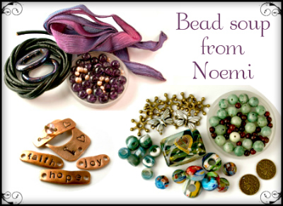
And so it's finally here, the third BSBP reveal. I signed up for BSBP again, not having joined for for a couple of rounds. Of cause that had made me very keen to participate again and I signed up -- completely forgetting that the dates could be in the middle of spring farming season. Oops! Of cause I couldn't know that the spring farming would start unusually late this year, but as luck would have it (for me), the reveal was postponed a couple of weeks so here I am, free from the potatoes and ready to show what I made with the lovely soup I got from my BSBP partner Noemi.

First, let's take a look on that spanish soup Noemi cooked up for me to work with.


You can read more about all the different ingredients here. It was a fab soup, but due to work, a workroom I couldn't work in (= no metalwork or techniques requiring a torch this time) and everything else that came in between, I still had my struggles with it. Mostly with getting ready in time with something I wouldn't be embarrassed to show anyone and that would make Noemi's soup justice. In the end, I ended up with four piece to show you today. Haven't yet used all the beads from the soup so there might be some "leftover posts" later.


First a quick (and hopefully enticing) sampler of what's to come below.


First up is the necklace made for the lampwork focal. I had matching fire-polished rondelles, but they were pretty tiny (as are most my beads, being used to working with dainty jewellery and seed beads) and there were only 30 of them. After going back and forth many times, I finally decided on just stringing them with dark green silk cord (in lieu of anything matching the chain) on a gunmetal chain.


Looking back at it, I should've added something to the last portion of the chain. Ran out of rondelles, but adding, say, some gunmetal beads would've looked better than just leaving it bare in the neck. Well, something to remember for next time, then.
 
And look at that wire wrapping -- you can tell I've almost only been seedbeading and embroidering these last couple or years!


For the next piece, I wanted to do something with the sweet little copper connectors and clasp, which are made by Noemi herself. Wanted to keep it simple in order not to overpower the connectors and this is what was finally settled on. Not the best chain to use -- if you want to try something similar, I'd suggest a small rolo/belcher or cable chain -- but the only one I had that matched the copper. As it was slightly boring with just the chain, I wrapped some dusky dark purple anchor embroidery floss around the links. Don't know if it made it better or worse! *lol* I do enjoy embroidery so threads and floss is something I like to add to my jewellery nowadays.

The chain was so uncooperative I almost gave up, thinking of turning the connectors into little charms with a bead dangle in one end (it would've included a maneki neko charm, sorry all catlovers who didn't get any cat jewellery here). But I persevered.


Third piece is a silk wrap bracelet. First I thought of altering the ribbon in some way, either embroidering it, smocking it or adding a beaded edge, but in the end it all came down to my wanting to try an idea. Now, I'll say right away that it's an idea that maybe looks nice, but wasn't as practical as intended.


The idea was to lose the clasp and use the rubber o-rings to tighten the ribbon ends, then tucking them under the ribbon as with other wrap bracelets. But the wrap part made it more cumbersome than practical -- next time I'll try it with a simple bracelet that doesn't wrap around the wrist several times. (Also, the focal was supposed to be black to match the o-rings, but I hadn't time to blacken it. Some of you might prefer the antique bronze colour it has now, though.)


And so, the fourth and last piece. I wanted to use those vibrantly coloured crackle beads, but couldn't think of anything fun to do with them last minute (made it yesterday). Ideally I wanted to keep them mixed with the fw pearls in the colour combo Noemi created, but some of my teal supplies kept trying to get my attention, wanting to play with the purple beads. Finally, I caved and created this simple leather necklace with beads dangling from waxed linen cord attached to the leather using lark's head knots.


That's all, folks! My creations for this year's edition of BSBP. Now be sure to visit my BSBP partner Noemi, who had this eclectic (and somewhat boringly coloured) soup to work with:


And of cause a huge thank you to Lori for hosting this great (in fabulousness and size) event once again! You're fab!

*

For a complete list of all participants in the 3rd reveal of the Bead Soup Blog Party, please visit Lori's blog here. As Lori makes her way through the blogs, she will replace the links with direct links to the reveal posts, making it easier for us who will take a long time going through all 200+ blogs in this reveal. 

You will also be able to find many of the creations from all three of the reveal on the official 7th BSBP pinboard at Pinterest.


Related Posts Plugin for WordPress, Blogger...