Saturday, 18 February 2012

Aurica sampler, part 1


A few weeks into the Take a Stitch Challenge, I got the idea to experiment a bit and stitch with some of my novelty yarn instead of just using embroidery floss. Of all the knitting yarns, I picked up a ball of Red Heart Aurica ribbon yarn. It turned out to be a lot of fun working with it in my needlework.

Here is the first "sampler" of the TAST stitches I've made with the yarn so far. Hopefully it might be of inspiration to others who enjoy needlework and wants to try something a little bit different. As usual you can click on the pics for a larger image.


Feather stitch


The sample that started it all. Loved the effect and decided I should try to do every stitch with this yarn.


Detached chain stitch


This week's stitch was detached chain or daisy stitch. I will make a proper TAST post on this stitch next week. Until then you'll have to make due with these experiments, mostly made thinking they could be used as petals for embroidered flowers or perhaps dragonfly wings.


Blanket stitch, Fly stitch & Herringbone stitch


For the herringbone I did both a single and double version of the stitch.


Cretan stitch


As with the herrinbone, I also tried a double version of this stitch.


Chevron stitch


With the chevron stitch, I only got this far, trying just one basic version.


Straight stitches


This isn't part of the TAST challenge and I don't think it will be either, being such a basic stitch. The long stitches are twisted, one harder than the other -- a silk ribbon embroidery technique I read about at Di van Niekerk's blog.


~*~ You can find all my TAST posts here. ~*~

Bead blog recap w. 6-7


It's been another two weeks so time for the biweekly summary of my writings on my other blog, Manekis Pärlblogg. Not that many posts this time, but hopefully still something of interest. Photo and pricing tips, new contests, leather and suede roses, twin bead project and inspirational ideas are some of the things you'll find in the list.

Friday, 17 February 2012

Pink as autumn colour


These are some photos I took last year when I, inspired -- or if you prefer, challenged -- by the Pantone Color of the Year 2011 ( Honeysuckle) and the photos I showed in Autumn in pink and chartreuse, thought about different ways of using pink in my beadwork.

I had used a special kind of pink, the lovely juicy padparadscha, with my favourite brown and olive green/kakhi autumn colours several times so it wasn't a novel idea to me, pink as part of an autumnal palette. But this time I tried a few other combos too, using varying pinks such as rose satin and indian pink instead of just padparadscha. Never got around to post the pics during autumn and them came winter and if felt too late. But now I'm dusting them off.


This post is related to my "Turquoise as an autumn colour" and "Lime and chartreuse as autumn colours" on my other blog. There I discussed these colours that you might not consider autumnal and how to use them in autumn-themed colour palettes.

Thursday, 16 February 2012

Twin beaded beads


Having scoured the web for twin bead projects (a post on that subject will be published on my other blog tomorrow), I had to finally get around to using my bag of  twin beads that I got weeks ago.

I felt like beginning withh some beaded beads. Forgot to print out Simone's lovely free project Twin BB so even though it was a project I wanted to do once getting the beads, I ended up with two other designs instead. The big beaded bead was inspired by a pretty design spotted on the blog Micaoldala. (That link is not just for crediting her with the initial idea, but also because I think you should check out her other lovely twin design in that blog post too.)

The design is similar in structure to "hana-ami beaded balls" -- like e.g. this one or this one -- but the 2-hole bead design mean you have to stitch it in slightly different way. Still, if you know how to make that kind of beaded beads, it shouldn't be too hard for you to figure out how to make this ball.


The smaller beaded bead was a pure experiment. I wanted to do something similar to these with five beads on each side. It didn't work as I couldn't "close" the beads in a ring on the back. So I added a third row of beads. If you look carefully you can see that it's not even: one side is flatter than the other. Makes it looks something like a small round cone (cone as in strobilus) or hops.

And that's what I've done with my twin beads so far. Not very much, but at least I can say I've tried them and don't have to feel bad about the unopened bag of beads anymore. Now I have to sketch on new ideas and add some more colours to the stash -- but it'll have to wait until I've finished the challenge entries (and possibly also a small contest entry).

Anyone else that've used the twin beads? I'd love to see some pics of what you've done with them.

Tuesday, 14 February 2012

Båstad and Laholmsbukten *image heavy*


I sort of promised to show some photos of Bjäre clad in snow yesterday, but without much advance warning by sis and I decided to tag along when mom drove to Båstad so I spent most of my time yesterday there. My sis had her camera with her, more or less by accident, but it turned out to be a fab thing. When we reached Italienska vägen, the road leading into the village of Båstad, we could as usual get a great view of most of the bay Laholmsbukten, the bay between the Bjäre peninsula and the province of Halland. Seeing ice covering it almost all the way out to Norrviken, we quickly decided that we just had to got down to the sea after running the bank errands that had originally prompted my sis to go.

So the good thing is I've got some new sceneries to show instead of the same old spots I always post about.  And maybe I should warn that this post might get picture heavy. As always you can click on the photos to enlarge them.


We went down to Brunnsparken, which really isn't much of a park: it's just a strip of grass and some trees separating the shore from the houses and Strandpromenaden, the promenade stretching along the shoreline from east to west.

You can't see it in the photos, but our old school is just down by the promenade. Not many people have had the luxury of having a "seafront school" and indeed today no school would be placed at such an attractive location. No, it'd be nothing but top class hotels and millionaires' villas. In art class we would every now and then be allowed to go down to the beach on a good day to draw swans, seascapes etc, sitting in the sand or on the old WW2 concrete bunkers (part of Per Albinlinjen) and enjoying the sunny weather. You can see the bunker in the pic below.


This is a view of the shoreline stretching towards Malen.


The ducks and gulls saw us straight away and swam/walked to use in a big, loud group. They were very disappointed when realising we hadn't got any food for them. No swans to be seen, though. (As for that last pic I don't know why, but when I uploaded it Blogger rotated it like that. Tried to do it again, but with the same result.  *argh*)


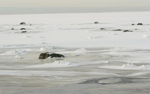
Turning our attention from the birds, I took some photos of the sea. The first photo is taken on the pier.


We then proceeded to the harbour and I took a photo of Båstad as seen from the pier. And one of the ridge, Hallandsåsen. As you can see, it more or less surrounds the village on all sides. Well, except for the seaside of cause...


We continued west, passing Hotell Skansen and the old cannons protecting us from the russian. Or at least they used to do that in the old days. These cannons were in fact used against the russian navy, who attacked the village in the summer of 1788. The bath house belongs to the hotel. This beach, Skansenbadet, is one of the most crowded in the summer, being next such popular places as Pepes Bodega and the centrecourt.


I know it sounds weird, me living on a small peninsula and all, but I haven't been down by the shore in wintertime for years so the frozen seascape really fascinated me. Sure I see (and take lots of pics of) the icy sea from a far, but I very rarely get this close.


We continued passed Lejontrappan with it's lion fountain -- a lion with a very wonky nose as it's fallen of several times and been patched together -- and the fancy villas. This part of the promenade was actually closed as they are still restoring the walkway after the damages done by the advent storm I wrote about here, but no one was working at the part we were on so we walked there anyway (as many others had also done).


Then we thought it was time to go back and decided to take another route through the village, following Lindallén and Aghardsgatan, instead of going the same way back again. These pics are from Aghardsgatan -- houses for the rich, just like the villas.


On the short end of one of the houses on above mentioned street you can find this cannon ball embedded in the wall. It is said to be a memory from the attempted russian invasion that day in August,1788. When I was a kid I thought it had lodged itself there when fired from the ship's cannons. A lot of kids have thought that. Nor is it conclusively proven to be a russian cannon ball at all, but a good tale is always a good tale.

And again Blogger has rotated the portrait format pics. Why, Blogger, why??

Well, Blogger's issues aside I hope you've enjoyed reading through this long post. And I hope you like the seascape as much as I did.

Valentine card


Well, I'm still editing my photos, but in the meantime I wanted to take the opportunity to show the valentine's card I got for Michelle Mach's Valentine Challenge.

The challenge was to alter a plain embossed card any way we wanted. Like several of the participants I had no real experience in paper crafts, lacking both the skills and the materials and tool to make any kind of more professional looking card, but it was a challenge and I sometimes find it hard to say no to a challenge. Even if it is in a medium I'm no more than a newbie in.


This is what the card Michelle sent me looked like before I altered it. At first I just thought of it as being in landscape format and this is how I kept looking at it when planning and playing with different ideas. Then one day I turned it 90 degrees and realised it looked better in portrait format.


And this is what the card ended up looking like. I began by colouring the leaf pattern with watercolour pencils in spring green and light brown -- two colours I felt worked well with the cream white paper. I then wanted to add a quote and not having the time or resources to make a fancy stamping or image transfer I had to write it my hand. Lettering isn't my strong side, but what can you do?

The text means "Love [in order] to live. Live [in order] to love." I wanted something love related that was more philosophical than something addressed to a lover. More about love than about valentine.

As the card felt pretty bare, I thought of what material I had that could add to the design without overpowering the simplicity that I liked. My eyes fell on some pink tissue paper that I cut into flowers. Using the dull point of a brush shaft I pushed the flowers into a pin cushion to cup them. The remaing five flowers were shaped the same way, but using a pencil point so they became more ruffled, perfect for the centres.

So all in all not one of my best creations, but there are details I like (such as the flowers) and I probably shouldn't be too hard on myself considering that I'm a newbie in the art of card making after all.

If you want to see what the other participants made with their cards, please check out Michelle's valentine challenge blog post.
Related Posts Plugin for WordPress, Blogger...