Showing posts with label copper. Show all posts

Thursday, 2 January 2014

Dark mori


Mori kei and dark mori has found their way onto my clothes pinboard.


I'm not mad about clothes. To me they're not something to spend a lot of time and money on. While there are clothes I absolutely love and drool over, lamenting the fact I can't afford them, I'm not like many other girls/women who seems so very dedicated to clothes or at least to shopping for clothes. It's even worse with shoes, though that's partially because I can't find the type of shoes I really like and the one type of shoes I do love, the clogs, aren't suitable outside the farm. Of cause it's partially a money and body issue: if you don't bother to look at clothes because you can't afford them anyway or the designer clothes doesn't go up to your size, you don't develop an interest in them.

It doesn't however mean that I've got absolutely no interest in how I dress or in finding a good style. If I had the money, I would go hunting. Not for a lot of clothes, just enough to have a wardrobe for various occasions in a style I feel comfortable in. And that's the thing: without money to buy that style and relying mostly on a handful of plain, cheap clothes (some of which I've had since the 90's) for any occasion when I interact with other people and a bunch of boring mainly hand-me-downs of some sort or other for wearing around the farm. I have no clothes that really express, nothing that says something about who I really am. Well, of cause they do to some extent, especially my long skirts that family members and relatives "complain" about (I wear long skirts in winter if I want to, thank you very much!). But it's just skirts similar to what I like as I make due with the cheapest skirts, not the skirts that are the most my style. What I wear is plain and I don't really want to be seen as plain when that's not really who I am. Shy, yes, but not boringly plain as my clothes seem to signal to others.

Of cause, it would be easier to wear something my style if I could find my style and find the clothes that express something I want to express. With just a small interest in clothes, you don't always pinpoint a style as it's more about finding something simple and cheap that will do, something that can be used for a long time and is acceptable e.g. in school or at work. I have of cause found pieces of clothing I like and that's a start and I do drool over certain styles like goth and steampunk, but while I love the drama they haven't felt like an all around look for me. Those clothes are good for dressing out, but not dressing up so to speak. Love them, but couldn't see myself in them every day or even every weekend.

But recently something happened. Enlightenment.

Just before the new year, I happened to stumble over a new word, mori, and a search later, I found something that really struck a chord with me: dark mori. This japanese street fashion style is also called strega or black forest mori. It's a darker version of mori kei ("woodland style", often just called mori or, when referring to someone wearing the style, mori girl), which is a very romantic and rustic countryside look in white and light pastels, vintagesque and boho, layered and loose-fitting -- many times crinkled or slightly tattered -- clothes in natural fibres. Frills and laces can often be seen, though some seem more prone to love the sweet look with lace and subtle prints while others seem to prefer cleaner lines and solid coloured fabrics. Mori can be dreamy, victorian-inspired or modern minimalist with nature, countryside and green living as the common denominator. Some would probably see it, and especially dark mori, as a boho style and others would spot american hipster styles in the japanese street fashion style. It also share a characteristic with lagenlook what with the focus on loose, layered clothes. It's similar but not the same as the fashion style natural kei. The lifestyle associated with mori is one of closeness to nature, a love of reading and writing, bike rides, forest walks and tea drinking. Perfect for daydreamers and introverts with its focus on the little things in life and activities in solitude as well as meeting friends.

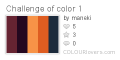
Cutesy mori kei and white-is-the-only-colour rural romanticism can be too sweet for me (and is far from the countryside as I, a farm girl, know it!) and that's where dark mori comes in. Sure, mori kei can include earthy purples, montana blues, burgundy, brown, deep green and other colours than white and beige but it's still a lot about those bleached neutrals. Dark mori adds a bit of darker colours (goth black as well as other colours, e.g. purple, brown and red), depth and a raw, worn look -- and it has an extra dimension that's really my style: it draws inspiration from the dark, shadowy forest rather than the light, sunny forest of the mori girl's daydreams. Fairytales, magic, mysticism  and european folklore/folktales are some of the sources the style finds inspiration in. All of mori is inspired by fairytales, but dark mori brings out the darker and more dramtic sides of them. If the ethereal mori girl is the sweet princess waiting in a sunny glade for her prince, the dark mori girl is the nyctophiliac or witch who doesn't shy away from the shadowy parts of the forest. It's more goth, to compare with another subculture.

But don't take my word for it, I'm a newbie in the mori world and hardly the one to describe or define it! You can read more about this relatively new style for example in this Goth (Stereo)type infographic, at Carnevale Salt and Strega's Forest. Notice that there is a certain width in the style and the three examples offer slightly varying definitions. The last one being more goth than the first two, for example, and focusing more on the dark or sometimes even grim strega, i.e. witch, while the other two focus more on romantic dark fairytales and nature.Of cause, you can see styles that would fit in the dark mori style, but which aren't called that and created by people that have never heard about mori or dark mori.There's also no definite line between mori and dark mori, it's more of a sliding scale where some are more drawn to lace and romance and others to the darker sides of things.

To some extent, I've always dressed a bit mori-esque at home with layered clothes and a love for long skirts, natural materials and at least a partial love of muted colours such as linen/sand and puce. (And an attitude against ironing as unnecessary, resulting in crinkled skirts.) And it's always been mixed with my love of nature, the countryside, poetry, fairytales and the calmer joys in life (reading, picnics, hot cocoa, sitting with a cat in the lap). Though my look has been rather plain with more jersey and other cotton knits that anything else at it's cheap and widely available in the mainstream mail-order catalogues and mall stores -- and that's all I can afford.

On the other hand, I've had the goth side of me since my teens, which has always loved the total opposite or the mori kei colours: black, dark purple, burgundy etc. And while I still drool over dramatic goth clothing, the dark mori style is so much more me. It even ties in with my penchant for (or rather, on-and-off relationship to) the steampunk style with it's more earthy layered and tattered victorian-inspired styles in shades of brown and brass. It might seem a bit boring to some, but I really love it.

For me, this was an epiphany of sorts. Not only did someone just put together so many of the things I love and find interesting into one concept for me to define with, but it also helped me find a focus on my style and a new keyword to explore. Not just my style of clothes, which was great, but my style of everything from interior design to jewellery. Not that all my jewellery is dark mori style -- far from it! -- but it's the kind of stuff many of my WIPs are about and defining a focus on a style has really been inspiring for me. It brought back some things I haven't thought about in a while such as runes, magic and the old witchcraft traditions which then mixed with the love of dark fairytales, which is always in the back of my head. And with a word or label to put on something, you can suddenly search for more things in the same vein and you can use it to find others who like the same things you do.

So really, I'm starting this year by taking up some of the thoughts, ideas and styles that have floated in and out of my life the last 15-20 years or so, tying them together and -- hopefully -- being able to more firmly express myself and shape my own style. Some start their year by finding a word to live by, I'm starting my year with a concept to explore!


Monday, 2 December 2013

4th annual Challenge of Color


I wasn't sure if I was going to be able to do something for this challenge when signing up, but the idea Erin presented for this the 4th annual Challenge of Color was so fun that I finally did sign up.  Keeping my fingers crossed that there'll be something to blog about today.

You can read about the colour challenge game here. In short it's a combination of a colour game and a word game where you start off with one word and search for a colour using it and then use the last word of that colour to search for the next colour. I'll be showing two colour palettes I made using this game/challenge here. First up is my very first try at it. (Note that you can click on the palette thumbnails to see a bigger picture of it at Colourlovers.)

Challenge_of_color_1
Color by COLOURlovers

dragon prince  
prince charming  
charming orange  
orange dusk  
dusk of blue

Not surprisingly it started out with the word dragon and ended with something less predictable for me: blue. Read as a text it looks like notes for a fantasy story about a dragon prince watching the sunset or something.

While I didn't have any plan for the colour combinations other than to pick colours that looked pretty (and with a name that made it possible to continue the game), I did end up with a palette that turned out to be pretty easy to work with considering I decided on making this a stash busting challenge. I do have components in these colours, even the blue, but even more so I realised I've got some space-dyed viscose gimp in pretty much exactly this palette. No cheating, I swear it wasn't until rummaging through the stash that I realised it.

Ok, it's got a somewhat green tint on one side and it would've been better if combined with the light copper and montana blue cord I also have, but it's still pretty close (not sure how well the colours show up in my photos though).


So it does perhaps look like an easy challenge, but I still procrastinated and got very little done as I felt stuck. In the last minute I made this simple necklace using the whole skein of gimp. It's pretty much just folded on the middle with strands held together with rubber o-rings (quicker than whipping the ends, but wish I had some other colour than black) and copper jump rings attaching the clasp to the cord.


But that does not feel like a finished piece and I really, really wanted a pendant or some other form of focalpiece. Or maybe even just some beads randomly placed on the cords. It's just... I haven't found a focal that feels right yet. One idea was to make a clasp using a big flower or something, but there wasn't one in the right size and colour for me to use -- and I want the dark colours in front.

The closest I've found is this:


But I don't know... Just before going to bed my brain asked me why I didn't just make a pendant using my ginormous stash of seed beads and cabs. A bit too late, brain! Well, if nothing else I could just keep it as is, without any kind of focal, or wrap it a couple of times around my wrist and wear it as a bracelet instead (= no need for focals)...


*

For my second palette, I picked one of my own colours to start with. Partially because I couldn't think of a good word to start with, but partially also to challenge myself to use something other than just the favourite words that kept popping up in my head that day. So that way my first colour and starting point became powdered thyme.

CoC_v.2
Color by COLOURlovers

powdered thyme  
thyme & again  
again home  
home is Argentina  
Argentina sky

Again, the challenge ended up somewhere quite unexpected. Starting with thyme and ending with the argentinian sky. And creating a lovely, soft palette along the road.
 
While I really like the colours and should be able to find quite a few matching beads or fibres in the stash right away, I didn't end up with enough time to make something. At least not something tangible, but I did do something creative with it: a pattern (using the pattern template Peonies by yoksel) that I later used in my twitter background (not that I use my twitter account, but I do have one and wanted a prettier background than the one I had). There's a special "Twitter Profile Designer" on Colourlovers called Themeleon that allows you to use your own or others' patterns on your Twitter.

tranquility
Vector Patterns by COLOURlovers

That's the pattern above (click on it to go to Colourlovers and see it full scale) and here's the Twitter page:


*

So that's what I ended up doing, but as I see it this will be an ongoing challenge. I'll keep doing these word/colour games on Colourlovers (here's my profile if interested) and find inspiration for my creative process in it. It's a lot of fun almost a bit addictive once you start. If you haven't tried it, you should! Therefore I want to end this post with a big thank you, Erin, for coming up with this fun, inspirational challenge for us to play with!


PS! To see all participants in this challenge blog hop, please click here.

Thursday, 20 June 2013

Solder and tin paste experiments


So step one was to clear space at the worktable. Last night and today I got some time to play a little at that very table. Got to make use of the workspace now that I have it, right? Keeping it simple, I just picked up a few things to dabble with: little copper pendants, solder, flux and tin paste. Things that require that special workspace as it meant lighting that micro torch for the first time in ages.

Now, I should say that I've never soldered anything (if you don't count that copper spiral I added some solder to just to test if I'd be able to do some sort of solder joint). Have pretty much just melted solder from time to time, wondering when I'd make a project requiring this particular skill. And I don't have any good instructions for using tin paste so it was basically about playing around and see what happens. Of cause using due precautions as I'm using stuff that comes with warning labels.


These were my first two experiments. On the one of the left I used some plumber's silver solder I got from my dad. Don't really use it much since it didn't say what's in it and I do prefer to know that. It took time to melt, that much I know at least -- which is why I accidentally created the big dollops of unmelted solder. Drops that turned out to add a nice texture so it was a pretty good mishap.

The one on the right is tin solder (tin/copper/silver). The idea was to try this technique -- also see this link -- but I don't have the right stamps (clear stamps is a bad idea, don't ask me why I say that!). So instead I just melted solder and then hammered it a bit. All copper pendants are heated and hammered prior to solder application, by the way.

Both pendants were then oxidized using a tiny bottle of stink -- AKA liver of sulphur -- that I've had for ages, but actually use sometimes. Just a few drops are needed so the little bottle last a long time.


Then of cause I had to test my tinning paste (99,9 % tin). In theory I know how to use it, but I've never read any clear, detailed instructions. I didn't want to just tin the surface, but create a water drop effect described by Fleur Grenier in her book Pewter: Designs and Techniques. Unfortunately her instructions are really scarce, the only time she mentions tin paste and it's when describing how she made a project of hers, not one of the step-by-step projects in the book. It pretty much assumes you know your way around tin paste weirdly enough for a beginner's level book, which it is. Anyway, these were my first two tries at the water droplet tinning techniques. Far, far from perfect (I want the copper surface to show through between drops as in the book), but at least it's droplets. Not bull's-eye, but at least somewhere on the target.

The right one is oxidized.


Then just a few hours ago, I made these two samples. Same as above, just less paste and more dotted onto the surface than above. Both pieces where then oxidized soot black.

A fun time playing, even if not all samples are what I was striving for. But, hey, I am a newbie at solder and tin paste so what else is to be expected? I need to learn and practice -- and, besides, some of the pieces are cool and I do really like them. Below are my top 3.


Those results are really worth working more with, see where it will take me and what potentials there are in the techniques. Just need to polish my technique and read up on some basics while I'm at it.

What do you think?


~*~


Just a little footnote, which is pretty OT: Have you seen that I've added a new pinboard on my Pinterest page? It's called Colour it! and is all about painting, dyeing, drawing and in other ways adding colour to materials such as fabric, paper, metal, wood, glass etc. Not including patina, faux finishes and crackle as there's already a board for that. (It's amazing how fast you get up to over fifty boards -- Colour it! is board no. 63. I'm conservative when it comes to adding more boards and now there's over sixty anyway.)

Saturday, 27 April 2013

Bead Soup Blog Party 3rd Reveal


And so it's finally here, the third BSBP reveal. I signed up for BSBP again, not having joined for for a couple of rounds. Of cause that had made me very keen to participate again and I signed up -- completely forgetting that the dates could be in the middle of spring farming season. Oops! Of cause I couldn't know that the spring farming would start unusually late this year, but as luck would have it (for me), the reveal was postponed a couple of weeks so here I am, free from the potatoes and ready to show what I made with the lovely soup I got from my BSBP partner Noemi.

First, let's take a look on that spanish soup Noemi cooked up for me to work with.


You can read more about all the different ingredients here. It was a fab soup, but due to work, a workroom I couldn't work in (= no metalwork or techniques requiring a torch this time) and everything else that came in between, I still had my struggles with it. Mostly with getting ready in time with something I wouldn't be embarrassed to show anyone and that would make Noemi's soup justice. In the end, I ended up with four piece to show you today. Haven't yet used all the beads from the soup so there might be some "leftover posts" later.


First a quick (and hopefully enticing) sampler of what's to come below.


First up is the necklace made for the lampwork focal. I had matching fire-polished rondelles, but they were pretty tiny (as are most my beads, being used to working with dainty jewellery and seed beads) and there were only 30 of them. After going back and forth many times, I finally decided on just stringing them with dark green silk cord (in lieu of anything matching the chain) on a gunmetal chain.


Looking back at it, I should've added something to the last portion of the chain. Ran out of rondelles, but adding, say, some gunmetal beads would've looked better than just leaving it bare in the neck. Well, something to remember for next time, then.
 
And look at that wire wrapping -- you can tell I've almost only been seedbeading and embroidering these last couple or years!


For the next piece, I wanted to do something with the sweet little copper connectors and clasp, which are made by Noemi herself. Wanted to keep it simple in order not to overpower the connectors and this is what was finally settled on. Not the best chain to use -- if you want to try something similar, I'd suggest a small rolo/belcher or cable chain -- but the only one I had that matched the copper. As it was slightly boring with just the chain, I wrapped some dusky dark purple anchor embroidery floss around the links. Don't know if it made it better or worse! *lol* I do enjoy embroidery so threads and floss is something I like to add to my jewellery nowadays.

The chain was so uncooperative I almost gave up, thinking of turning the connectors into little charms with a bead dangle in one end (it would've included a maneki neko charm, sorry all catlovers who didn't get any cat jewellery here). But I persevered.


Third piece is a silk wrap bracelet. First I thought of altering the ribbon in some way, either embroidering it, smocking it or adding a beaded edge, but in the end it all came down to my wanting to try an idea. Now, I'll say right away that it's an idea that maybe looks nice, but wasn't as practical as intended.


The idea was to lose the clasp and use the rubber o-rings to tighten the ribbon ends, then tucking them under the ribbon as with other wrap bracelets. But the wrap part made it more cumbersome than practical -- next time I'll try it with a simple bracelet that doesn't wrap around the wrist several times. (Also, the focal was supposed to be black to match the o-rings, but I hadn't time to blacken it. Some of you might prefer the antique bronze colour it has now, though.)


And so, the fourth and last piece. I wanted to use those vibrantly coloured crackle beads, but couldn't think of anything fun to do with them last minute (made it yesterday). Ideally I wanted to keep them mixed with the fw pearls in the colour combo Noemi created, but some of my teal supplies kept trying to get my attention, wanting to play with the purple beads. Finally, I caved and created this simple leather necklace with beads dangling from waxed linen cord attached to the leather using lark's head knots.


That's all, folks! My creations for this year's edition of BSBP. Now be sure to visit my BSBP partner Noemi, who had this eclectic (and somewhat boringly coloured) soup to work with:


And of cause a huge thank you to Lori for hosting this great (in fabulousness and size) event once again! You're fab!

*

For a complete list of all participants in the 3rd reveal of the Bead Soup Blog Party, please visit Lori's blog here. As Lori makes her way through the blogs, she will replace the links with direct links to the reveal posts, making it easier for us who will take a long time going through all 200+ blogs in this reveal. 

You will also be able to find many of the creations from all three of the reveal on the official 7th BSBP pinboard at Pinterest.


Tuesday, 12 March 2013

What I got from Noemi


Finally, I've gotten around to taken a few photos of the bead soup I got from Noemi for the party in April. Curious about what I got? Well, let's go through the "loot".


In the first gift bag, I found this gorgeously coloured mix of silk ribbon, leather cord (which gave me a real urge for liquorice -- fortunately, I bought a bag when picking up the package from the local post agent), beads and two ceramic links. Those colours are just so me, don't you think? Mmmm, purple...


It also included these lovely, delicate copper components: a toggle clasp and three links with stamped words. I forgot to include them in the first pic, which would've made it easier to gauge the size of these petite pieces. When showing a close-up like this they risk looking big and chunky while in real life, they're so sweet and dainty. So pretty!


In the other organza bag, I found this mix of bronze-coloured components and beads with the big, heart-embellished lampwork bead as the pièce de résistance (see photo below). Again, you can find some of my favourite colours here: green. Especially the lampwork bead have captured some luscious green tones. Add to that the bronze/brass-coloured findings that I always enjoy.


front
back

So as you can see I got a fab, inspiring bead soup to work with. Now that the music blog hop is over, I'm going to just focus on this soup, hoping to create something worthy of this beautiful gift. I'm really looking forward to playing and creating with these components.


Thank you so much, Noemi, for the lovely bead soup!


Tuesday, 28 February 2012

Peanut oil patina


I'm editing photos for the Challenge of Music reveal, but thought I'd just show a couple of other pics while I'm at it.

Some time ago I heard about peanut oil patina and researched it a bit. Liked what I saw in the photos I found and in the end I decided to try it out. Now, finding peanut oil turned out to be a little tricky and none of the text found talked about any other oil. In the end I did find the right oil, but then after buying it other things got in the way so the bottle just sat there by the worktable for weeks and months. This weekend I tought it'd be a good subject for my other blog so I had to give it a try.

First piece, the copper blank on the right in the photo above got a bit too dark. Did know all instructions said to heat the metal slowly and stop when the right colour was reached, but I just had to add a little more heat. And a little more. And in the end it turned out very dark. But still nice and shiny so it isn't ruined.

For the second piece, a bronze tag, I didn't torch the oil as much and it turned out a nice dark golden colour. The unflattering light spots are water drops. There were some water on the pin I used to suspend the tag while torching and it spattered when heated by the torch, I guess.


I then had to ask myself if it was possible to use other, more common, oils and took some rapeseed oil from the fridge and also found some castor oil leftovers from the time me and my sis dabbled in making DIY make-up and cosmetics.

Now, at this point I should've read this list because while the rapeseed worked pretty much as well as the peanut oil, I set fire to the castor oil. The others just smoked. This one was suddenly engulfed in flames. Ooops... If nothing else, I should've known enough about cooking to consider the smoking point! But in the end, that bronze tag too got a nice patina.

The rapeseed oil tag looks better IRL, really. Also keep in mind that not only are these the result of my first try at the technique, I was too lazy to clean any of the tags befor torching them so with better preparation and careful torching the result would probably be even nicer.


Top row: plain bronze, peanut oil
Bottom row: rapeseed oil, castor oil

Monday, 8 August 2011

A tiger lily in autumn


 Well, it's been a chilly (below 15 °C), rainy day which started out ok but ended with thunder and hail, so maybe it isn't strange than I rather think of warm autumn days, saturated with colour. And, anyway, I know it's not uncommon for beaders as well as others to be inspired by the coming season rather than the current. Even by those of us that don't bead to sell and therefore have to be ready with an appropriate collection when the season begins. Though, I'm not sure it was thoughts of autumn that (consiously) inspired this bracelet. Rather it began with a thought and a bead and then the other colours where chosen to work with it.


I made the bracelet for Heather Powers' Inspired by Nature challenges -- which you should read about if you don't already know about them -- the theme of the week being tiger lily. When I first read that my crystal chili pepper flower beads came to my mind. The chili pepper finish is kind of a shiny slightly reddish amber. It's a coating on clear glass which means it can have a charming variation in depth. The colour (to some extent) reminded me of the orange lily and the shape echoed the petals of the tiger lily.


As I only had four flowers, I also added a few similar beads in crystal brandy and then crystal apricot 8 mm daggers for leaves. For the findings, I wanted something that enhanced the sparkling autumn colours so I chose bright copper plate and solid copper (the head pins).

The delicate chain with the elongated links was twisted and folded double. Both to form a more substantial chain and to give an illusion of some sort of intertwining vine or some such. It was a bit tricky, not least since the links are so elongated that the twist ends up slightly too loose for a charm bracelet. But I still like it.

As so often it ended up being a pretty dainty bracelet (this time partially due to bead shortage, but it's also my style) and I think it might look good worn together with a couple of other autumn themed bracelets. What do you think?


Friday, 1 July 2011

Metallic butterfly wings


This little critter is an Arte Metal decorivet by Vintaj that I got as part of the delicious beady mail I got when winning the Rings & Things blog partner drawing this spring. If you want to see what it looked like before I altered it -- forgot to take a pic myself -- you can find a photo here.

Inspired by a keum-boo butterfly, I wanted to add a mottled effect to the wings using leaf metal flake. Leaf metal often comes in sheets, but flakes are -- as the name inplies -- a blend of different types/colours of leaf metal in small flakes. They are sold in different colour combination and here I choose to use one with purple and rose flakes on top of the gold, silver and copper ones. That is gold- and silver-coloured copper, not precious leaf metal.

Compared to working with sheets, it's very easy to "gild" a surface using flakes. For a mottled effect like this one you just simply dip the surface -- painted with size -- into the flakes, let it dry a little and brush of excess metal with a soft brush before letting it set completely. If you don't like the result, add size to points you like to cover with a different colour flakes and either dip again or apply single flakes to the spots using a soft, dampened brush.

The butterfly has tiny specks of leaf metal on the body. That's because I initially wanted to add foil to the bands across it, but didn't like the result so I scraped it off. You can't really see much of it IRL as the butterfly is smaller than in my photo, but I'll try and scrape some more off before sealing the gilding. Because it's copper-based, the leaf metal can easily tarnish unless coated.

Not my best work using leaf metal flakes, but a fun -- if slightly fiddly -- alternative to using paints, alcohol inks, gilder's paste and such.

Wednesday, 12 January 2011

Forged copper rings

Haven't I showed you these before? I made a coupled of hammered copper rings from 12 G (2 mm) bare copper Artistic Wire as one of my inspiration projects for Fru Pärla (you can find the rest here or in the shop's gallery).
They're really simple to make: just anneal and hammer, anneal and hammer, anneal and hammer. I don't even have a ring mandrel to I shaped these (with my hands and a hammer) around a sort of cardboard core from a note paper roll. It worked. I created different rustic textures using the ball on a ball-peen hammer, the wedge of a cross-peen hammer and, on one of the rings, coarse sandpaper -- se pic below for a close-up. I hand-polished all rings to a subtle shine, except for one that I oxidized using the egg method and one that I blackened.

Thursday, 9 December 2010

Flower charms with stamen

A simple way to make flowers with stamen is to take some ball-end headpins, make loops on them and attach to an eyepin before putting the flower on it. Well, here I wanted to use my thin copper headpins and instead of using the more common method I just outlined, I pushed three pins through the hole of the bead, distorting them a bit so the flower wouldn't slide all the way down to the ball ends. Then I finished it off by making a messy wrapped loop using all three wire ends.


I think this is a very simple technique, though it can be a bit messy wrapping three wires instead of just one. Sometimes I make a wrapped loop with all three wires, other times I just loop one of them and wrap the rest around the first wrap. As the wire is relatively thin, I worry that just one wire is too fragile.

The colour of the two flowers at the top is tanzanite celsian while the last charm (it's two photos of one charm) is tropical topaz, a blend of brown and olivine green. I'm especially fond of the latter, eventhough the colours are something you'd probably see in leaves rather than flowers.

Monday, 13 September 2010

Crimp cover bracelet


I'm not a big fan of ball chains, but sometimes I see an idea that I like (as braiding with them) or I get an idea of my own. This was the case when I recently bought some solid copper ball chain. With the new texture styles and various colours in crimp covers, wouldn't it be useful as more than just crimp covers? Couldn't they be nice as "proper" design elements too? And aren't the balls in the ball chain the perfect size to be covered by a crimp cover? This is my first try at finding an answer for those thoughts. Very simple, but then again, I just wanted to test a theory and didn't have any plan for what to do.

Some day I'll have to try a few different designs like mixing colours and sizes of crimp covers and/or adding more covers -- perhaps even covering every other ball.

Wednesday, 30 June 2010

Rivet first, think later


Ok, I think I really like riveting. (After all, I really liked hammering nails as a kid so this was probably a logical development.) But I think I might like it a wee bit too much. This is my second riveted flower. As seen before in the Flowers and leaves post, but now without the centre bead.

So what's the problem? Well, I've riveted these layered flowers together before thinking about what I wanted to do with them. If I'd been smart, I would've waited long enough to determine if I should've added some sort of finding, bail, metal blank or other part to the layers of metal before riveting them together. E.g. adding a brooch pin to the back or a bail so I can use it as a pendant without having to add a bail or drill a hole afterwards. Well, while riveting the second flower that did hit me. And now I try to plan ahead a bit more before hammering down that rivet.

Ah, yes, unlike with my first riveted flower, I can actually show you a pic of the back. I use pre-made rivets so it's only this one side of the rivet I hammer down. Not the best pic, but -- well -- at least you can see what a hammered rivet looks like if you're unfamiliar with the technique.
Related Posts Plugin for WordPress, Blogger...