

I wasn't sure if I was going to be able to do something for this challenge when signing up, but the idea Erin presented for this the 4th annual Challenge of Color was so fun that I finally did sign up. Keeping my fingers crossed that there'll be something to blog about today.
You can read about the colour challenge game here. In short it's a combination of a colour game and a word game where you start off with one word and search for a colour using it and then use the last word of that colour to search for the next colour. I'll be showing two colour palettes I made using this game/challenge here. First up is my very first try at it. (Note that you can click on the palette thumbnails to see a bigger picture of it at Colourlovers.)
Color by COLOURlovers
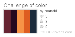
dragon prince
prince charming
charming orange
orange dusk
dusk of blue
Not surprisingly it started out with the word dragon and ended with something less predictable for me: blue. Read as a text it looks like notes for a fantasy story about a dragon prince watching the sunset or something.
While I didn't have any plan for the colour combinations other than to pick colours that looked pretty (and with a name that made it possible to continue the game), I did end up with a palette that turned out to be pretty easy to work with considering I decided on making this a stash busting challenge. I do have components in these colours, even the blue, but even more so I realised I've got some space-dyed viscose gimp in pretty much exactly this palette. No cheating, I swear it wasn't until rummaging through the stash that I realised it.
Ok, it's got a somewhat green tint on one side and it would've been better if combined with the light copper and montana blue cord I also have, but it's still pretty close (not sure how well the colours show up in my photos though).
.JPG)
So it does perhaps look like an easy challenge, but I still procrastinated and got very little done as I felt stuck. In the last minute I made this simple necklace using the whole skein of gimp. It's pretty much just folded on the middle with strands held together with rubber o-rings (quicker than whipping the ends, but wish I had some other colour than black) and copper jump rings attaching the clasp to the cord.

But that does not feel like a finished piece and I really, really wanted a pendant or some other form of focalpiece. Or maybe even just some beads randomly placed on the cords. It's just... I haven't found a focal that feels right yet. One idea was to make a clasp using a big flower or something, but there wasn't one in the right size and colour for me to use -- and I want the dark colours in front.
The closest I've found is this:

But I don't know... Just before going to bed my brain asked me why I didn't just make a pendant using my ginormous stash of seed beads and cabs. A bit too late, brain! Well, if nothing else I could just keep it as is, without any kind of focal, or wrap it a couple of times around my wrist and wear it as a bracelet instead (= no need for focals)...

*
For my second palette, I picked one of my own colours to start with. Partially because I couldn't think of a good word to start with, but partially also to challenge myself to use something other than just the favourite words that kept popping up in my head that day. So that way my first colour and starting point became powdered thyme.
Color by COLOURlovers
powdered thymethyme & again
again home
home is Argentina
Argentina sky

Again, the challenge ended up somewhere quite unexpected. Starting with thyme and ending with the argentinian sky. And creating a lovely, soft palette along the road.
While I really like the colours and should be able to find quite a few matching beads or fibres in the stash right away, I didn't end up with enough time to make something. At least not something tangible, but I did do something creative with it: a pattern (using the pattern template Peonies by yoksel) that I later used in my twitter background (not that I use my twitter account, but I do have one and wanted a prettier background than the one I had). There's a special "Twitter Profile Designer" on Colourlovers called Themeleon that allows you to use your own or others' patterns on your Twitter.

Vector Patterns by COLOURlovers
That's the pattern above (click on it to go to Colourlovers and see it full scale) and here's the Twitter page:

*
So that's what I ended up doing, but as I see it this will be an ongoing challenge. I'll keep doing these word/colour games on Colourlovers (here's my profile if interested) and find inspiration for my creative process in it. It's a lot of fun almost a bit addictive once you start. If you haven't tried it, you should! Therefore I want to end this post with a big thank you, Erin, for coming up with this fun, inspirational challenge for us to play with!
PS! To see all participants in this challenge blog hop, please click here.
AWESOME! I love the two palettes you created! I even love the gimp necklace as it is. Very tactile. I love the gradation of color and I just know you will find the best option for a focal. The pattern you made is very cool! I love getting lost in the colors and patterns. I was having extreme computer issues this weekend so I only managed to get one piece done. My post is live now, come and see and be sure to leave your URL so others can come and visit you too! Thanks for taking the time to play along with me! Enjoy the day. Erin
ReplyDeleteBoth palettes are great but I sure do love that first one! I can also understand why you don't consider the piece quite finished, not that there is one thing wrong with it or the pendant you used with it. I have done that before.....completed something then had that gut feeling that it needed some extra step. It will come to you eventually. We both know that these things come when least expected and not at all if you push them, LOL. Very nice.
ReplyDeleteI love the colors in both palettes. The necklace or bracelet is very cool on its own and I know you'll find a focal for it. I love the idea of beading one. There is just something about seed beads. :)
ReplyDeleteLove the color palettes you created. Especially the last one. And love the necklace as well. What a clever idea to use gimp as the main component! Love it. And I think the pendant can go very good with it as well.
ReplyDeleteLove your color palettes. Seems like this was pretty challenging and fun for participants. I really like the gimp necklace the way it is. Just really pretty. And I'm showing my neophyte status by saying I had never heard of gimp, and now I want some because it looks so good!
ReplyDeleteYeah, do get yourself a skein of gimp, it's real fun to play with! And it's not just a matter of being new if you hadn't heard of it: the term gimp is more common in embroidery/needlework and haberdashery (it's used in tassel making) than in beading and jewellery making. More often than not it's simply called rayon/viscose cord in a bad shop. If you can find it there; craft shops and embroidery suppliers are better places to go looking for it.
DeleteLovely palettes and I think we all have that "work in progress" thing going on when it comes to designing and fiddling it out (I love that feeling when - Bam! You hit your stride and everything falls into place... wish it was more than fleeting for me at times).
ReplyDeleteKeep at it - this is a fantastic jumping off point! I do really like those black O-rings btw - a nice contrast to the earthy palette... :)
Thank you for your kind comments! I'm working on a scarf now and then I really should finish another piece, but after that I hope to come to a final decision on the necklace. Maybe I just keep it as it, if nothing else just to wait for the right pendant to cross my path. One thing's for sure, though: I will make more gimp necklaces like this. It's a great quick and easy way to make a necklace for a pendant.
ReplyDeleteNice design all around, especially the palette colors.
ReplyDeleteLove your palettes, and the gimp necklace is great -- isn't it nice when you find the right thing in your stash? Hope that finishing touch makes its presence felt sooner rather than later.
ReplyDeleteOh wow - what gorgeous colours - I love how you combined graduated the colours to reflect the palette you chose - both are beautiful!
ReplyDeleteAmazing! I didn't even consider using the patterns utility after I created my palette - yours looks brilliant.
ReplyDelete